

Key Takeaways
Treat every slide as a solution for the audience, not a container for content
Design serves people. Reynolds opens with washoku, a Japanese meal prepared to balance color, taste, texture, and presentation. Its visual impact comes not from decoration but from thoughtful choices about what belongs and what does not. The same test applies to slides: does each choice help an audience understand, trust, or remember the message? Design is problem-solving from the viewer’s point of view, not a chance to show off software or personal taste.
Simplicity takes work. A traditional wagasa umbrella appears spare, yet its graceful simplicity depends on the skilled work of several craftspeople. Good slides follow the same logic: the maker does the hard editing so the audience can understand with less effort. Start with the idea and the audience, sketch options, and only then choose the tools and effects.
The meal and umbrella make an important distinction between simplicity of experience and simplicity of production. In product design, a clear interface often conceals substantial decisions about users, constraints, and failure points. Presentation design works similarly: a clean slide is not automatically a clear one, and attractive styling cannot rescue a weak or inaccurate claim. The strongest test is practical: can a listener grasp the intended point without having to decode the slide? That standard keeps aesthetics in service of communication rather than treating polish as proof of quality.
Make projected words readable from the last row, then let your voice do the work
Design for distance. Projected text must be understood quickly by people at different distances, so choose a size that works from the back of the room. If the slide cannot be read easily in the software’s slide sorter view, it may be too small. Too much text is often a signal to rethink the presentation, not shrink the font. For detailed material, use a document or handout instead of making the audience squint.
Let type support the message. Typeface, weight, size, spacing, and placement all affect tone and clarity. Reynolds recommends relying on one or two type families, using strong differences in size or weight to show hierarchy, and checking the spacing between large letters and lines. In a live talk, slides should illustrate and reinforce the speaker’s words, not compete with them or become a script read aloud.
The last-row test treats legibility as a relationship among content, screen, room, and audience, rather than as a font-size rule applied in isolation. It also exposes a useful distinction: presentation slides and reference documents serve different attention patterns. The advice to reduce text is especially strong for live talks, where reading and listening compete for attention. It should not become a blanket ban on words, however. A technical audience may need precise labels, and access needs vary. The better question is whether the text can be read comfortably without displacing the speaker’s central idea.
Use color to label, contrast, and direct attention, not decorate
Begin with contrast. Color has three useful dimensions: hue is the color’s identity, value is its lightness or darkness, and saturation is its intensity. For clear slides, value contrast often matters more than hue. A chart that remains legible in grayscale is less likely to rely on color distinctions some viewers cannot see. The book notes that color vision deficiency affects about 8 to 10 percent of men and about 1 percent of women.
Use a restrained palette. Sumi-e, Japanese brush painting using black ink, demonstrates how varied tones and empty space can carry a visual message. Reynolds’s “achromatic +1” approach uses black, white, and gray with one accent hue. Monochromatic or neighboring colors can unify a deck; opposing colors can create emphasis, but may need softer tints or shades to avoid visual strain. Pick colors for a clear role, such as identifying a category or highlighting a key result.
Color is often treated as an expressive layer added after the information is organized. The book’s emphasis on value reverses that order: contrast establishes whether the information can be seen at all, while hue can then add identity and mood. This is a useful connection to accessible data design, where redundancy matters. A category should not be distinguished by color alone if a label, shape, or position can clarify it too. Emotional associations also vary by context and culture, so color may suggest a tone, but it cannot reliably dictate one.
Let one compelling image carry the story your statistics cannot
Make the general tangible. Reynolds recalls a high-school presentation about pollution, built from photographs of threatened natural beauty and evidence of damage. Because film was expensive and slow to develop, he planned the story before taking pictures. The images were evidence and emotional context, not decoration. A photograph can give an abstract issue a specific human or physical presence, while narration explains what the audience should notice.
Choose and frame with intent. A relevant, high-quality image can be cropped to strengthen its composition or expanded to fill the slide for greater impact. Avoid distorted, pixelated, watermarked, clichéd, or unrelated imagery. Video can show a process or change over time, and can refresh attention when it directly supports the point. The image should deepen the story, not merely make the slide look busy.
Images can make an argument feel concrete, but emotional force is not the same as evidentiary force. A photograph may illuminate who is affected by a problem while still failing to establish its scale or cause. Pairing a particular story with reliable data can preserve both human relevance and analytical rigor. The choice of image also carries ethical responsibilities: subjects should not be reduced to props, and viewers should be able to distinguish documentation from illustration. The book’s core standard is sound: every visual should earn its place by contributing meaning.
Choose charts for the question, and remove what hides the answer
Match form to purpose. Tables suit exact values, bar charts support comparisons, line charts show change over time, and pie charts can show a small number of parts within a whole. The signal-to-noise ratio, or SNR, describes how much relevant information remains visible amid irrelevant visual elements. Decorative backgrounds, excessive labels, unnecessary colors, and too many data points lower that ratio.
Edit, then emphasize. Reynolds’s method is to restrain what is included, reduce nonessential elements, and emphasize the central finding without distorting the data. A declarative headline can state the chart’s point more clearly than a generic topic label. For complex figures that audiences must inspect closely, use a document or handout. Reynolds calls slides printed as if they were documents “slideuments,” a format that often makes material harder to read while using more paper and ink.
The chart-selection advice recognizes that visual clarity depends on the question being asked, not on a favorite chart style. It also connects to a broader principle of analytical honesty: emphasis is useful only when it preserves scale, uncertainty, and relevant comparisons. A striking headline can help an audience orient itself, but it can also steer interpretation too aggressively if the data are mixed. The practical safeguard is to make the claim inspectable: retain the context needed to test it, and reserve dense detail for a format where readers can study it at their own pace.
Leave deliberate space so important elements can breathe and guide the eye
Space is part of the design. Ma is the Japanese aesthetic concept of an interval or spatial void that gives relationships room to form. In ikebana, the art of flower arrangement, open areas help the stems feel connected and allow movement to be imagined. On a slide, empty space can separate ideas, make contrast visible, and direct attention toward the most important element. It is not wasted simply because nothing occupies it.
Balance need not be symmetrical. Centered, matching arrangements can feel stable, but they can also become static. Asymmetrical balance uses elements of different sizes or weights while keeping the overall composition coherent. Space can also imply what lies beyond the frame, inviting viewers to complete an image mentally. Use the edges deliberately: an image can fill the frame, or sit inside a consistent margin, but an accidental near-touch often looks like a mistake.
The idea of space as an active element is valuable because it shifts design from placing objects to shaping relationships. In music, pauses help define the notes; on a slide, quiet areas help define the content. The analogy also points to a limit: emptiness is not automatically clarity. A sparse slide can be vague, and a dense display can be appropriate when close comparison is the task. Space works when it creates a useful distinction or rhythm, not merely when it makes a composition look fashionable.
Give every visual a clear first stop, then lead viewers onward
Set a visual priority. Design priority is the planned order in which viewers notice elements. Size, contrast, position, and color can make one element dominant, then guide the eye toward supporting information. In a traditional Japanese room, the tokonoma, a simple alcove displaying art or flowers, provides a focal point within an otherwise uncluttered space. A slide benefits from the same clarity: viewers should know where to begin.
Guide without shouting. Gestalt describes how people organize visual parts into meaningful wholes. Principles such as proximity and continuation help viewers see which elements belong together and where to look next. Faces and movement attract attention readily, so use them only when that attention serves the point. Animation can reveal a complex diagram step by step or mark a meaningful change, but constant motion competes with the message.
A clear focal point reduces the cost of figuring out where to look, a problem that matters especially when a speaker is talking at the same time. The room analogy is effective because it shows that focus can come from the quiet around an object, not just from making the object louder. There is also a persuasive dimension: whoever controls visual hierarchy influences what appears important. That power should be used transparently. A strong design makes the intended claim easy to see, while leaving enough context for the audience to question it.
Build a small visual system so varied slides still feel like one story
Create unity through repetition. A consistent color accent, type family, image style, or recurring visual cue helps audiences recognize that separate slides belong to the same presentation. Related items should be placed near each other, and aligned elements should follow a simple grid. The rule of thirds, a three-by-three guide, places subjects near grid intersections rather than automatically centering them. It is a useful starting point, not a law.
Keep variety purposeful. A Japanese bento box organizes many kinds of food within a small container, using arrangement to make variety feel coherent. Slides can do the same: repeat a few visual choices while varying composition to maintain interest. Reynolds’s examples use grids to create structure without eliminating experimentation. A recurring overview slide can also mark the audience’s place in a longer presentation, much like signposts on a route.
Consistency is not merely a branding concern. Repeated visual cues lower the effort of recognizing what is familiar, leaving more attention available for what changes. That makes contrast more meaningful: a single accent color can carry emphasis when it is not competing with a dozen other accents. Yet a visual system can become monotonous or exclusionary if it depends on subtle color differences, tiny labels, or culturally specific symbols. Strong systems combine recognizable repetition with enough variation to serve the content and the audience.
Improve your eye through reflection, observation, and small deliberate redesigns
Treat improvement as a practice. Hansei is a process of reflection on a situation or project, including when things seem to be going well. Kaizen means continuous improvement: making small, steady changes rather than waiting for a dramatic overhaul. Applied to presentation design, this means reviewing slides, noticing what works in the surrounding visual world, and making focused revisions.
Collect, test, and learn. Reynolds recommends keeping examples of effective and ineffective design, observing signs and packaging, and sharing discoveries with others. Begin ideas on paper or a whiteboard before moving to slide software. Sketching several possible treatments makes it easier to judge the idea before becoming attached to the first polished version. Constraints can help: a limited palette or a clear audience need forces choices. The aim is not to follow rules mechanically, but to understand why a choice helps or hinders communication.
The book treats visual literacy as an acquired habit rather than a mysterious talent. That is a practical claim: focused attention can turn ordinary surroundings into a library of examples, and reflection makes those observations useful instead of merely memorable. Small revisions also make experimentation less risky. A caution is that collecting references can become imitation if the designer copies appearances without understanding their purpose. The more transferable question is what problem a design solves, for whom, and under what constraints. That turns inspiration into judgment.
Analysis
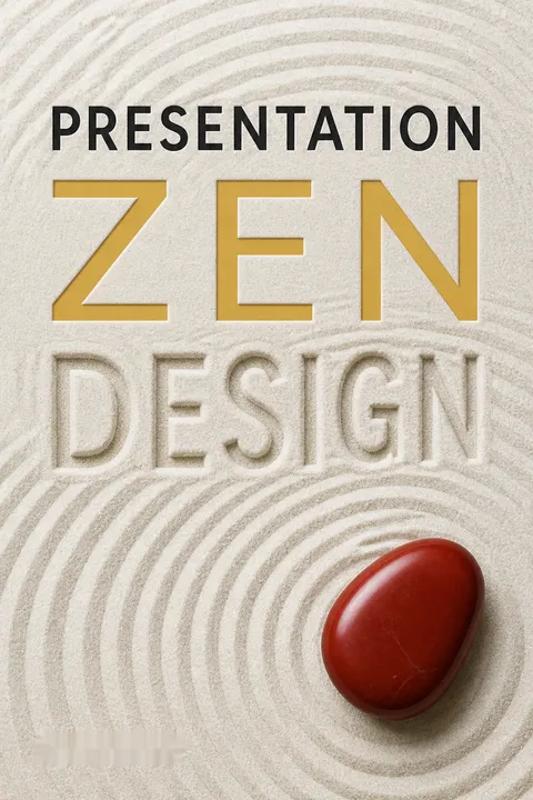
Presentation Zen Design is a practical guide to visual communication, organized as a progression from components such as type, color, images, and charts to principles such as space, focus, and harmony, then to examples and ongoing practice. Its audience is professionals who use slides but have little formal design training. The challenge in adapting it is breadth: the book moves between Japanese aesthetics, design instruction, presentation craft, and software-era technical advice. Its coherence comes from one recurring claim: visual choices shape how people understand a message, so they should be made for the audience rather than by default.
The most useful contribution is not a prohibition on text or a preference for minimalism. It is a way to diagnose visual decisions. Is the type legible? Does contrast reveal the point? Does the chart answer the relevant question? Is the focal point intentional? Does the deck feel like one argument? These questions help translate abstract taste into revisable practice. The book’s stories, from the balanced meal to the quiet tokonoma, give concrete form to principles that might otherwise sound like slogans.
Its strongest tension is between clarity and completeness. Live slides need to work quickly, while scientific and business communication often requires qualifications, methodological detail, and uncertainty. The distinction between presentation slides and documents helps, but speakers must still avoid making a simplified visual seem more conclusive than the evidence allows. Likewise, principles drawn from Japanese aesthetics can inspire fresh choices without being treated as universal rules for every culture or audience.
Some software examples and technical recommendations reflect the book’s 2009 publication and have aged. The durable material lies elsewhere: plan before decorating, use contrast and space deliberately, choose visual forms that fit the task, and observe how real people encounter the work. Design here is neither ornament nor a substitute for substance. It is the craft of making sound ideas easier to see, follow, and remember.
Review Summary
Presentation Zen Design is highly praised for its practical advice on creating engaging presentations. Readers appreciate the concise summaries of design principles, numerous examples, and tips for improving slide aesthetics. Many find it valuable for both beginners and experienced presenters. The book's emphasis on simplicity and effectiveness is well-received. Some readers note overlap with the author's previous work but still find it worthwhile. Overall, it's considered a must-read for anyone looking to enhance their presentation skills.
People Also Read





Glossary
ma
Meaningful interval or spaceA Japanese aesthetic concept describing an interval of space or time that shapes the whole composition. In visual design, ma is not merely unused background. It can separate elements, suggest movement, create balance, and make the occupied parts more noticeable. Its value depends on how the empty area relates to the surrounding forms.
signal-to-noise ratio (SNR)
Relevant information versus clutterA way to think about how much of a visual communicates the intended information compared with how much distracts from it. In a chart, the signal is the data and its intended message. Noise includes irrelevant decoration, clutter, or excessive detail that makes the data harder to see. A stronger ratio makes the point easier to identify.
achromatic +1
Grayscale plus one accentA color approach using black, white, and shades of gray, with one hue added for emphasis or visual unity. It draws on the clarity of a grayscale design while reserving color for a deliberate role, such as highlighting a key chart element. The accent should not be the only way viewers can understand the information.
slideuments
Slides misused as documentsReynolds’s term for documents made in presentation software and then used as projected slides or printed handouts. Such files often try to serve both purposes at once, resulting in slides that are too dense for a live audience and documents that lack the detail or readability needed for close study. The term points to a mismatch between format and task.
Gestalt
Perception of organized wholesA body of ideas about how people perceive relationships among visual elements and organize them into meaningful patterns. In presentation design, principles such as proximity, continuation, closure, and figure-ground help explain why nearby items seem related, why the eye follows lines or alignments, and why viewers mentally complete incomplete forms.
design priority
Planned order of visual attentionThe deliberate assignment of importance to elements in a composition, so viewers can tell what to notice first, second, and afterward. Size, contrast, position, color, and spacing can establish this hierarchy. A clear design priority prevents the eye from wandering among elements that compete equally for attention.
rule of thirds
Three-by-three composition guideA compositional guide that divides a frame into three equal columns and three equal rows. Placing a subject or key element near the gridlines or their intersections can create a more dynamic arrangement than automatically centering it. Reynolds treats the rule as a flexible starting point for photographs and slides, not a guarantee of good design.
kaizen
Continuous small improvementsA Japanese term for improvement, used in the book to describe steady, ongoing refinement. Applied personally, kaizen means making manageable changes to design knowledge and skill over time rather than expecting one dramatic leap. Observation, practice, and recurring revisions allow small improvements to accumulate.
hansei
Reflective review for learningA Japanese practice of pausing to examine a situation or project and consider how it could improve. It applies even when the results seem successful. In the book, hansei supports learning by making reflection a deliberate step rather than assuming that experience alone will produce better judgment.
sumi-e
Japanese ink brush paintingA Japanese brush-painting tradition, commonly made with black ink on paper or silk. Reynolds uses it to illustrate how limited means, tonal variation, and carefully chosen strokes can express a subject’s essential character. Its visual restraint also demonstrates the importance of leaving space and giving each element a clear purpose.
FAQ
What's "Presentation Zen Design" about?
- Focus on design principles: "Presentation Zen Design" by Garr Reynolds emphasizes simple design principles and techniques to enhance presentations.
- Visual communication: The book explores how to use visuals effectively to communicate ideas clearly and memorably.
- Inspiration from Zen: It draws inspiration from Zen aesthetics, focusing on simplicity, balance, and harmony in design.
- Practical guidance: The book provides practical advice for creating engaging and effective presentation slides.
Why should I read "Presentation Zen Design"?
- Improve presentation skills: It offers valuable insights into improving the design and delivery of presentations.
- Learn from Zen principles: The book integrates Zen principles, which can help in creating more impactful and aesthetically pleasing presentations.
- Enhance visual literacy: It helps readers develop a better understanding of visual communication and design.
- Practical examples: The book includes real-world examples and case studies to illustrate its concepts.
What are the key takeaways of "Presentation Zen Design"?
- Simplicity is key: Emphasize simplicity in design to enhance clarity and engagement.
- Use visuals effectively: Leverage images, color, and typography to support and amplify your message.
- Balance and harmony: Achieve balance and harmony in your slides to create a cohesive and professional look.
- Continuous improvement: Adopt a mindset of continuous improvement and learning in design.
How does Garr Reynolds incorporate Zen principles into presentation design?
- Simplicity and restraint: Zen principles emphasize simplicity and restraint, which Reynolds applies to slide design by removing unnecessary elements.
- Balance and harmony: Zen aesthetics focus on balance and harmony, guiding the arrangement of elements on a slide.
- Naturalness and authenticity: Zen encourages naturalness, which Reynolds translates into authentic and genuine presentation styles.
- Mindfulness in design: Zen mindfulness is reflected in the careful consideration of each design element's purpose and impact.
What are some practical design tips from "Presentation Zen Design"?
- Use large images: Full-bleed images can create a powerful impact and draw the audience's attention.
- Limit text: Keep text minimal to avoid clutter and maintain focus on the speaker's message.
- Choose harmonious colors: Use a limited color palette to create a cohesive and visually appealing presentation.
- Emphasize key points: Use contrast and hierarchy to highlight the most important information on each slide.
How does "Presentation Zen Design" suggest using color in presentations?
- Create harmony: Use color to create harmony and unity across slides, often through monochromatic or analogous schemes.
- Emotional impact: Understand the emotional associations of colors and use them to enhance the message.
- Contrast for clarity: Ensure sufficient contrast between text and background for readability.
- Use restraint: Avoid overusing colors; simplicity in color choice can lead to more effective communication.
What role does typography play in "Presentation Zen Design"?
- Readability and clarity: Choose typefaces that are easy to read and appropriate for the presentation's tone.
- Hierarchy and emphasis: Use different font sizes and weights to establish a hierarchy and emphasize key points.
- Consistency: Maintain consistency in typography to create a cohesive look across slides.
- Avoid clutter: Keep typography simple and avoid using too many different fonts or styles.
How does Garr Reynolds address the use of images in presentations?
- Complement the message: Images should complement and enhance the spoken message, not distract from it.
- High-quality visuals: Use high-quality, relevant images to create a strong visual impact.
- Full-bleed images: Consider using full-bleed images to maximize their effect and engage the audience.
- Avoid clichés: Steer clear of overused or generic images that do not add value to the presentation.
What are the common mistakes in presentation design according to "Presentation Zen Design"?
- Overloading slides: Avoid cluttering slides with too much text or too many images.
- Inconsistent design: Ensure consistency in design elements like color, typography, and layout.
- Ignoring white space: Use white space effectively to create balance and focus.
- Poor image quality: Avoid using low-resolution or irrelevant images that detract from the message.
How does "Presentation Zen Design" suggest achieving balance and harmony in slides?
- Use asymmetry: Asymmetrical balance can create a dynamic and engaging design.
- Align elements: Align text and images to create a sense of order and connection.
- Consider visual weight: Balance the visual weight of elements to guide the viewer's eye naturally.
- Utilize grids: Use grids to structure the layout and maintain consistency across slides.
What are the best quotes from "Presentation Zen Design" and what do they mean?
- "Simplicity is not simple." This quote emphasizes that achieving simplicity in design requires careful thought and effort.
- "Design is about finding solutions." It highlights the problem-solving nature of design, focusing on clarity and effectiveness.
- "Without space, you’re dead." This underscores the importance of white space in creating balance and focus in design.
- "Design matters." A reminder that good design can significantly enhance communication and engagement.
How can "Presentation Zen Design" help in continuous improvement of presentation skills?
- Adopt a kaizen mindset: Embrace continuous improvement by regularly reflecting on and refining your presentation skills.
- Learn from examples: Study real-world examples and case studies to gain insights and inspiration.
- Practice mindfulness: Be mindful of design choices and their impact on the audience.
- Seek feedback: Use feedback to identify areas for improvement and make incremental changes over time.
About the Author
Other books by Garr Reynolds

Download PDF
Download EPUB
.epub digital book format is ideal for reading ebooks on phones, tablets, and e-readers.








