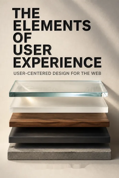


Key Takeaways
Design the experience people encounter, not just the product's feature list
Small failures accumulate. A clock with confusing controls can be reset accidentally. A coffee maker that gives no sign it is running may leave breakfast unfinished. A card reader with unclear instructions sends a rushed customer inside, where a difficult till slows the line. Each looks like a separate mishap, but each reflects a design decision that made ordinary use harder.
Use reveals the design. User experience is how a product works from the outside, where people meet it. It includes appearance and function, but also whether the parts make sense together in the user's situation. For a complex product, every feature, button, and step can either support the task or add another chance for confusion.
What's notable is the shift from treating errors as isolated user failures to tracing them through the designed environment. A single frustrating interaction may be minor, but repeated friction can reshape how customers judge a company. This systems view is useful beyond screens: instructions, physical controls, and service procedures all contribute to the same experience. The caution is that not every bad outcome can be designed away. Context, chance, and user differences remain real, so good design reduces avoidable friction without promising perfect control.
Balance user needs and organizational goals before choosing features
Start with two questions. What should the product accomplish for its organization, and what are people trying to accomplish with it? Their answers form the strategy. Product objectives may include revenue, reduced support costs, or a clear brand impression. User needs must be understood separately, rather than assumed to match internal priorities.
Make success observable. A success metric connects a goal to a signal, such as return visits, task time, support calls, or purchase conversion. The right signal depends on the purpose: shorter visits could mean a task is easier, or that users are leaving. The book notes that even a small change in conversion can have a substantial revenue effect, while warning that outside events can distort measures.
This pairing guards against two familiar errors: building something the organization wants but nobody needs, or satisfying users in ways that cannot sustain the service. Metrics make strategy discussable, but they are proxies, not the goal itself. A team rewarded for longer visits might add obstacles to a task meant to be quick. The useful discipline is to state what behavior a measure represents, what would count as failure, and which external factors could explain the result.
Research distinct users instead of designing for an imaginary average
Differences change the design. People vary in their goals, knowledge, comfort with technology, and the roles they occupy. A novice using a stock-trading service may need a guided sequence; an experienced trader may need fast access to many controls. One interface cannot always serve both equally well, so research must reveal whose needs matter and where they conflict.
Turn evidence into usable portraits. Research can include interviews, surveys, observation, task analysis, and tests of prototypes. A persona is a fictional character grounded in research, used to represent a cluster of real users and keep their needs visible during decisions. The fiction helps teams remember the evidence; it should not replace contact with actual users.
Personas help convert abstract findings into a concrete design question: would this decision serve the kind of user represented here? Their strength is focus, especially when a team otherwise defaults to its own habits. Their weakness is false precision. Invented biography can make a stereotype feel like evidence. Good practice keeps each portrait tied to observed needs and revises the user groups when research shows that the original categories do not fit.
Trace every decision through five connected layers of the experience
A map, not a waterfall. Garrett's model separates experience design into five connected planes: strategy, the aims of the organization and users; scope, the content and functions to provide; structure, how information is organized and behavior responds; skeleton, the arrangement of controls and navigation; and surface, what people sense in the finished product. A digital product may be both a tool and an information source, so different design concerns operate within the same model.
Decisions ripple. Surface choices depend on the underlying structure, while strategic choices constrain everything above them. If a design decision at the top conflicts with a lower-level decision, the team may need to revisit its assumptions. Work can overlap, but the foundations should be understood before the final form is locked in.
The model's practical value is diagnostic. When a button confuses users, the problem may be its appearance, its placement, its function, or the assumptions behind the feature. Separating these layers helps teams look for causes instead of polishing symptoms. The planes are not airtight departments, however. A navigation choice can change the information structure, and a technical constraint can force a strategic reconsideration. The model works best as shared vocabulary, not as a rigid handoff sequence.
Write requirements to define what ships, and what waits
Make the boundary visible. Requirements state what a product must include and give the team a shared basis for deciding when work is complete. Without them, a project can become a perpetual beta, accumulating features without a schedule or a finish line. Clear scope also identifies ideas that do not belong in the current release, so they can be considered later rather than smuggled into today's work.
Specify outcomes. A useful requirement is clear enough to test. Instead of asking for a vaguely popular video section, a team could define how items are ranked and displayed. Requirements should describe what the system will do, not merely what it must avoid. They can cover functions and content alike, including who maintains each content feature and how often it changes.
Written requirements are valuable less as paperwork than as a way to expose disagreement while change is still inexpensive. They also make trade-offs explicit: a feature may be desirable but infeasible within the available time or resources. The best specification is not necessarily the longest one. A document that lags behind the product becomes fiction, so requirements should stay lightweight, precise, and updated as implementation reveals what is actually possible.
Build information structures around users' mental categories, not org charts
Choose the organizing logic. Information architecture arranges content so people can find, understand, and use it. A team can begin with strategic goals and work downward into categories, or start with existing material and group it upward. Combining both approaches prevents an elegant plan from ignoring real content, and prevents existing files from dictating a structure that cannot grow.
Fit categories to the task. A car collection might be organized by make for shoppers, but by weight for people arranging overseas transport. Hierarchies suit many familiar categories; matrices can support different ways of browsing; sequential structures guide ordered material; organic structures allow open-ended exploration. User language, consistent labels, and metadata make these structures easier to navigate and search.
Taxonomies are not neutral filing cabinets. They decide which distinctions are prominent and which are hard to see, so an organization-centered structure can quietly impose internal categories on the public. The user's task offers a better test: does the organizing principle help people make the choice or find the information they came for? Flexibility matters too. A structure that fits today's inventory perfectly may become brittle as content and audiences change.
Make interaction predictable, and make mistakes recoverable
Model the user's expectation. A conceptual model is the idea a user has about how a feature works. An online cart behaves like a container: people add items, remove them, and complete a purchase. Familiar conventions can make a new system easier to learn, while an elaborate real-world metaphor can obscure what the system actually does. Consistency between features matters more than clever resemblance.
Design for errors. Prevent mistakes when possible, make them difficult when prevention is not possible, and help users correct or recover from them. A car with an automatic transmission prevents the starter from engaging in a gear that could make the vehicle lurch. In software, clear error messages and an undo option can help, but automatic corrections that override user intent can create fresh frustration.
This approach treats error handling as part of the main interaction, rather than a cleanup task. Prevention is powerful when the system can reliably identify an invalid action. Recovery is essential when it cannot. The balance is delicate: an interface that blocks too much can feel controlling, while one that permits irreversible mistakes leaves the burden entirely with the user. Predictability and a visible path back give people both safety and agency.
Use navigation and layout to show users where they are
Make choices legible. Interface design helps people act; navigation design helps them move; information design helps them understand what they see. A site may use broad links across its main sections, nearby links within a section, and relevant links inside the content. Each should show not only what destinations exist, but how they relate to the current page.
Give the structure a working form. Wayfinding helps users recognize their location and likely next steps. Because any page may be an entry point, each page needs enough context to orient someone who did not arrive through the home page. A wireframe lays out controls, navigation, and information before visual styling begins, making the intended page structure easier for designers, developers, and decision-makers to inspect.
Navigation quality is not measured by the smallest number of clicks. A few meaningful steps can be easier than a compressed sequence whose logic is hidden. The deeper issue is cognitive load: users should not have to reconstruct the site's organization every time they move. Wireframes make this concern visible early, although they are most useful when treated as collaborative models rather than rigid templates that dictate every later visual decision.
Let visual contrast guide attention without turning every element into a shout
Direct the eye deliberately. The surface is the sensory form of the product. For screens, visual design has particular influence: contrast can draw attention to important controls, while consistent spacing, color, and typography make related elements feel related. If everything stands out, nothing does. A quick visual review can reveal which element attracts attention first and whether that is the element users need.
Preserve a coherent identity. Color palettes and type choices can carry a brand, but they also affect clarity and readability. A design comp shows how components work together, while a style guide records decisions so later work does not become a patchwork of unrelated styles. Products beyond screens also use sound and touch, so sensory design depends on the medium.
Visual hierarchy is a form of instruction: it tells users what deserves attention before they read every label. Consistency supports recognition, while contrast distinguishes meaningful differences. But style rules should not become an end in themselves. A palette or grid that once fit the product may stop working as its functions expand. Visual standards need enough stability to support learning and enough flexibility to serve new content and devices.
Treat product development as paced learning, not a nonstop sprint
Alternate making and checking. Product work includes bursts of building and periods of testing, reflection, and adjustment. A team that pushes at maximum speed throughout may reach a deadline with a product that meets technical requirements but misses user needs. Prototypes and early user tests can reveal misunderstandings before they are buried beneath polished screens and completed code.
Match effort to the decision. Some tasks benefit from quick exploration; others, such as agreeing on goals or structure, deserve deliberate attention. Limited budgets do not eliminate user-centered work: teams can use existing feedback, recruit informal testers, or test rough sketches. Leaving all evaluation until launch week is risky because the remaining time and money may not allow meaningful fixes.
The pacing argument is about managing the cost of learning. Early feedback can challenge assumptions while the design is still easy to change; late feedback often arrives after those assumptions have hardened into expensive dependencies. Yet process cannot guarantee insight. Testing only answers the questions it is designed to ask, and users may struggle to articulate what they need. Deliberate design and observation are complementary tools, not substitutes for one another.
Analysis
Garrett's central contribution is a vocabulary for treating user experience as a connected design problem rather than a cosmetic layer added after development. The five planes help teams locate decisions at different levels, from organizational purpose to sensory detail. That distinction matters because a polished interface cannot rescue a product whose scope is wrong, just as a sound strategy cannot compensate for navigation that leaves users lost. The model is especially useful across disciplines. Product managers can connect goals to requirements, researchers can link user evidence to design choices, and developers can see why technical convenience is not automatically a user benefit. Its emphasis on explicit decisions also creates organizational accountability: if a feature exists, someone should be able to explain which need or objective it serves.
Its limitations are instructive. The framework gives strong attention to usability, business aims, and coherent implementation, but it offers less explicit guidance on whose needs should prevail when user groups conflict, or how to weigh accessibility, privacy, and broader social consequences. Naming user needs does not settle questions of power. Nor does measurement eliminate ambiguity: a return visit may indicate loyalty, or a task that requires repeated attempts. Metrics require interpretation and safeguards against incentives that reward the wrong behavior.
The planes should therefore be used as a diagnostic map, not a universal recipe. Their boundaries overlap, and real projects loop between research, implementation, and revision. The durable lesson is not to complete five stages mechanically. It is to make the reasoning behind product decisions visible, test those decisions against real use, and revise the underlying assumptions when the evidence does not fit.
Review Summary
The Elements of User Experience is widely regarded as an essential read for UX designers, offering a comprehensive framework for understanding and structuring user-centered design. Readers appreciate Garrett's clear explanations and the book's timeless principles, particularly the five planes model. While some find it dry or lacking in practical examples, many praise its ability to provide a holistic view of UX design. The book is considered foundational for beginners and a valuable reference for experienced professionals, though some feel it may be becoming outdated in certain aspects.
People Also Read







Glossary
The Five Planes
Connected design layersGarrett's model for organizing user experience decisions across five layers: strategy, scope, structure, skeleton, and surface. The layers move from goals and user needs toward the product's sensory presentation. Decisions are connected, so a choice at one layer can constrain or require reconsideration of choices at another.
user-centered design
Design guided by usersAn approach that takes users into account throughout product development. It asks teams to understand people's goals, circumstances, and expectations, then make design choices deliberately in light of that understanding. The approach does not promise that every preference can be met, but it makes trade-offs visible rather than accidental.
contextual inquiry
Study users in contextA set of research methods for understanding people in the circumstances where they normally act. Researchers observe or discuss how users handle real tasks and environments, drawing on approaches associated with anthropology. It can reveal behaviors and constraints that surveys alone may miss, but a deep study can require substantial time and resources.
personas
Research-based user portraitsFictional characters created from user research to represent the needs of a group of real users. A persona gives teams a memorable reference point when making design decisions. Details may be invented to make the portrait concrete, but its defining needs and characteristics should remain consistent with research evidence.
conceptual models
Users' ideas of system behaviorThe implicit or explicit understanding users form about how a product or feature behaves. A shopping cart, for example, suggests a container that holds selected items. Designers use conceptual models to make features understandable and consistent, and should avoid metaphors that make the system's actual behavior harder to recognize.
information architecture
Organization of informationThe arrangement of content and its relationships so people can find, understand, and use information. It includes categories, labels, and paths through a product. An effective architecture reflects both strategic goals and the way users think about the subject, while allowing for future growth and change.
controlled vocabulary
Standard set of termsA defined set of preferred words used consistently to describe concepts and content. It helps prevent internal jargon and competing labels from confusing users or fragmenting search results. A thesaurus can extend it by recording synonyms and relationships among broader, narrower, and related terms.
metadata
Information describing contentStructured information about a content item, such as its author, date, format, topic, or intended audience. Consistent metadata can support search, connections among related items, and alternative ways to organize content. Its usefulness depends on reliable definitions and consistent use of terms.
wayfinding
Cues for orientationDesign that helps people understand where they are, what is nearby, and where they can go. In a digital product, wayfinding can combine navigation links with labels, visual cues, and other information. It is especially important because users may arrive at a page without first seeing the site's home page.
Visual Vocabulary
Notation for site structuresGarrett's system of symbols for diagramming information architecture and interaction structures. It provides a shared visual language for representing components and their relationships, from simple site maps to complex flows. Teams can use such diagrams to discuss structure without relying on lengthy prose descriptions.
wireframe
Page structure sketchA simplified representation of a screen or page that shows the placement and relationships of navigation, interface controls, and information. It focuses on the product's skeleton rather than finished visual styling. Wireframes help teams inspect and discuss how a page supports the larger structure before detailed surface design.
FAQ
What's "The Elements of User Experience" about?
- User-Centered Design Focus: The book by Jesse James Garrett is about creating user-centered designs for the web and beyond, emphasizing the importance of considering the user's experience in every aspect of product development.
- Five-Plane Model: It introduces a five-plane model—strategy, scope, structure, skeleton, and surface—that provides a framework for understanding and improving user experience.
- Beyond Aesthetics: The book stresses that user experience is not just about aesthetics but also about how a product works and meets user needs.
- Practical Guidance: It offers practical guidance on how to apply these concepts to create cohesive and effective user experiences.
Why should I read "The Elements of User Experience"?
- Comprehensive Framework: It provides a comprehensive framework for understanding the different elements that contribute to user experience, making it a valuable resource for designers and developers.
- Improves Product Success: By focusing on user experience, the book helps readers create products that are more likely to succeed in the market by meeting user needs effectively.
- Applicable to Various Products: Although it focuses on web design, the principles can be applied to a wide range of products and services, making it versatile.
- Enhances Communication: It helps improve communication within teams by providing a common vocabulary and understanding of user experience concepts.
What are the key takeaways of "The Elements of User Experience"?
- User Experience Matters: A good user experience is crucial for the success of any product, as it directly impacts user satisfaction and business outcomes.
- Five-Plane Model: Understanding and applying the five-plane model can help in systematically addressing user experience issues.
- Strategic Alignment: Aligning product objectives with user needs is essential for creating a successful user experience.
- Iterative Process: User experience design is an iterative process that requires continuous evaluation and refinement.
What is the five-plane model in "The Elements of User Experience"?
- Strategy Plane: Focuses on aligning product objectives with user needs, forming the foundation for all design decisions.
- Scope Plane: Involves defining the functional specifications and content requirements that will meet the strategic objectives.
- Structure Plane: Deals with organizing the information and designing interactions to create a coherent user experience.
- Skeleton Plane: Focuses on interface, navigation, and information design to give shape to the structure.
- Surface Plane: Concerns the sensory design, including visual and other sensory elements, to create an appealing and functional product.
How does Jesse James Garrett define user experience in the book?
- Beyond Functionality: User experience is about how a product works on the outside, where users interact with it, not just its functionality.
- User-Centered Approach: It involves considering the user's needs, expectations, and behaviors at every step of the design process.
- Holistic View: User experience encompasses all aspects of a user's interaction with a product, including usability, design, and emotional impact.
- Strategic Importance: A good user experience is a strategic advantage that can differentiate a product in the market.
What are some practical applications of the five-plane model?
- Web Design: The model is particularly useful for web design, helping to create sites that are both functional and user-friendly.
- Product Development: It can be applied to any product development process to ensure that user needs are considered at every stage.
- Team Communication: The model provides a common language for teams to discuss and address user experience issues.
- Iterative Improvement: It supports an iterative approach to design, allowing for continuous refinement based on user feedback.
What are the best quotes from "The Elements of User Experience" and what do they mean?
- "Good user experience is good business." This emphasizes the idea that focusing on user experience can lead to better business outcomes by increasing user satisfaction and loyalty.
- "User experience is about how it works on the outside, where a person comes into contact with it." This highlights the importance of considering the user's perspective in design.
- "The practice of creating engaging, efficient user experiences is called user-centered design." This defines the core approach advocated in the book, focusing on the user's needs and behaviors.
- "A successful user experience is one in which the user’s expectations are anticipated and accounted for." This underscores the importance of understanding and meeting user expectations in design.
How does "The Elements of User Experience" address the role of content in user experience?
- Content as Key Element: Content is a crucial part of the user experience, as it provides the information users seek and interacts with.
- Content Requirements: The book discusses how to define content requirements that align with user needs and strategic objectives.
- Content Management: It highlights the importance of content management systems in maintaining and delivering content effectively.
- Content and Functionality: The relationship between content and functionality is explored, showing how they work together to create a cohesive user experience.
What is the importance of strategy in user experience design according to Jesse James Garrett?
- Foundation for Design: Strategy forms the foundation for all design decisions, ensuring that they align with both user needs and business objectives.
- Clear Objectives: Defining clear product objectives and user needs helps guide the design process and avoid scope creep.
- Success Metrics: Establishing success metrics allows for the evaluation of whether the user experience meets strategic goals.
- Evolving Strategy: The book emphasizes that strategy should evolve and be refined throughout the design process to remain relevant.
How does "The Elements of User Experience" suggest handling user research?
- Understanding Users: User research is essential for understanding who the users are and what they need from the product.
- Segmentation: The book suggests segmenting users into groups with common characteristics to better address their needs.
- Research Methods: Various research methods, such as surveys, interviews, and user testing, are discussed to gather insights.
- Personas: Creating personas based on research helps keep the user's perspective in mind throughout the design process.
What role does visual design play in user experience according to the book?
- Sensory Appeal: Visual design is part of the sensory experience, making the product appealing and engaging to users.
- Brand Communication: It plays a key role in communicating brand identity and supporting strategic objectives.
- Guiding Attention: Visual design helps guide the user's attention to important elements and supports navigation and information design.
- Consistency: Maintaining visual consistency across the product enhances usability and reinforces the brand.
How can "The Elements of User Experience" help improve team communication?
- Common Vocabulary: The book provides a common vocabulary for discussing user experience issues, improving team communication.
- Shared Framework: The five-plane model offers a shared framework for understanding and addressing user experience challenges.
- Cross-Disciplinary Collaboration: It encourages collaboration between different disciplines, such as design, development, and content creation.
- Documentation: Emphasizes the importance of documentation, such as wireframes and style guides, to ensure everyone is on the same page.
Download PDF
Download EPUB
.epub digital book format is ideal for reading ebooks on phones, tablets, and e-readers.








