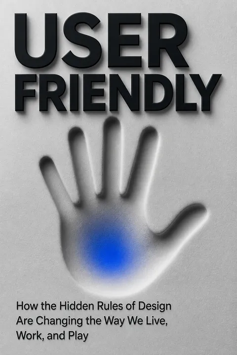


Key Takeaways
Design for the human mind, not the ideal operator
A room full of alarms. At Three Mile Island, operators faced more than a thousand dials and hundreds of warning lights during a reactor emergency. The problem was not that the workers were foolish. The control room gave them no reliable way to connect what they saw with what the reactor was doing. They lacked a mental model, an intuitive picture of how a system’s parts and functions fit together.
Make the system legible. After the accident, a training control room made the reactor’s major systems visible and easier to trace. Controls were grouped to reflect how the plant worked, and consistent signals clarified normal conditions. Even an unfamiliar user could better infer what was happening. The book’s central claim is that user-friendliness comes from fitting tools to real human expectations, not demanding that people think like machines.
This is a powerful reframing of usability: understanding is not a private accomplishment that users either possess or lack. It is partly produced by the environment around them. That insight aligns with distributed cognition, the idea that thinking is supported by tools, diagrams, and other people, not only by an individual brain. The control room is therefore part of the operators’ reasoning system. But legibility is not the same as simplicity. In a complex plant, hiding detail can also conceal danger. Good design must reveal the right structure without pretending the underlying system is simple.
A control that lies is more dangerous than no control
Feedback must tell the truth. Feedback is information a system gives about what happened after someone acts. At Three Mile Island, a warning light indicated that a valve’s switch had been turned off, not that the valve itself had closed. Operators read the light as confirmation that the reactor was safe, while water continued escaping through the open valve. The signal reported the operator’s intention, not the machine’s state.
Close the action loop. Reliable interfaces show whether an action succeeded and what changed as a result. A toaster’s click and heating sound, for example, help confirm that it switched on. At the plant, signals were inconsistent, misplaced, or absent, and the temperature readout eventually exceeded its range. In online commerce, buyer and seller ratings similarly give strangers information that helps them decide whether a transaction is safe.
Feedback is often treated as a small interface feature, but this example shows that it is a foundation for accountability. A system that confirms intent rather than outcome invites false confidence, a problem that appears in software, medicine, and public warning systems as readily as in industrial equipment. More feedback is not automatically better, though. Too many alerts can bury the meaningful signal in noise. The design task is to make the evidence timely, trustworthy, and proportionate to the decision at hand.
Treat recurring user mistakes as evidence about the design
Blame misses the pattern. During World War II, investigators found that pilots were crashing after confusing the controls for landing gear and wing flaps. In one twenty-two-month period, that mix-up contributed to 457 crashes. The controls looked alike and sat beside each other. The pilots’ errors were predictable consequences of the interface, not proof that they needed more discipline.
Fit tools to real use. Researchers including Alphonse Chapanis proposed controls that pilots could distinguish by touch and standardized where instruments appeared. Those ideas influenced aircraft design and later everyday interfaces. Industrial designer Henry Dreyfuss applied a related sensibility to consumer products, studying how people actually used them rather than simply styling their exteriors. His washing machine grouped controls together so users could grasp its functions more easily. The shift was from correcting supposedly deficient users to removing avoidable traps.
The shift from blaming operators to examining systems changes what organizations learn from failure. A mistake becomes diagnostic data: if many people make the same error, the design may be inviting it. This principle is valuable in safety engineering and in ordinary services, where repeated missteps can expose confusing assumptions. Still, design cannot eliminate every error, and training remains important when tasks are genuinely complex. The strongest approach treats training and interface design as complements, while resisting the convenient habit of making the least powerful person responsible for a flawed system.
Use familiar metaphors to make unfamiliar systems mentally navigable
Metaphors carry instructions. A metaphor links a new idea to something people already understand, helping them infer how it works without a manual. The early personal computer borrowed the desktop: files, folders, windows, and a trash can made digital actions resemble familiar office tasks. The Internet’s language of pages, links, and browsing likewise gave many Western users an initial picture of an unfamiliar network. In Delhi, by contrast, women who had little exposure to those metaphors often could not tell what the Internet icon meant or what the Internet contained.
Metaphors can shape behavior. Ford’s hybrid dashboard first showed battery charging, encouraging drivers to brake hard even though gentle braking was more efficient. Designers reframed the car as a coach and used growing leaves to reward economical driving. The image helped drivers connect small choices to a visible result, turning an abstract efficiency goal into something they could interpret.
Metaphors are not decorative labels. They distribute expectations: a desktop suggests orderly storage, while a feed suggests a stream that can keep flowing without being read in full. That makes metaphor a potent design tool and a source of hidden assumptions. A metaphor that works for one group may exclude another, as the Internet example illustrates. Designers should test not just whether a metaphor feels familiar, but what behavior and limits it quietly teaches. A helpful analogy can open a door, but it can also become a cage if mistaken for the whole system.
Watch real behavior, especially where average-user assumptions fail
Look beyond what people say. Henry Dreyfuss observed that farmers avoided a new theater because its luxurious carpet made them fear tracking in dirt. Replacing it with a plain mat helped the theater feel welcoming. Much later, IDEO’s researchers found that people’s accounts of their cooking did not always match what was in their cupboards. Stated preferences were not a dependable substitute for observing ordinary routines.
Search for hidden needs. A project called Ripple began as a proposed emergency button for real estate agents. Researcher Dusty Johnstone challenged the assumption that danger usually comes from a stranger. Since many assaults involve someone the victim knows, an immediate emergency call might escalate an ambiguous situation. The product was redesigned to offer a lower-pressure way to request help. Studying people at the margins can reveal needs that a supposedly average user obscures.
Observation helps distinguish a person’s stated goal from the practical and social conditions shaping their choices. That distinction matters because people can describe what they want while leaving out constraints they have learned to treat as normal. The method also redistributes expertise: users know their environments, while designers bring tools for interpreting patterns and testing responses. Yet observation is not neutral. Researchers decide whom to watch, what counts as a problem, and which solution is worth pursuing. Empathy is strongest when it includes curiosity about power and context, not merely sympathetic imagination.
Trust grows when machines signal intent and respect social context
Show what the machine knows. In an Audi self-driving test car, passengers could see a simplified picture of nearby traffic and a countdown before the car changed lanes. Lights around the windshield made clear when control shifted from driver to car. These cues helped people anticipate what the vehicle would do and understand what it could see. A driverless car that acts smoothly but gives no indication of its state can feel less reassuring than one that communicates clearly.
Machines enter social life. Researchers found that people often behave politely toward computers they have used, even when they deny doing so. The book argues that trust depends partly on familiar social expectations: relevance, clarity, and appropriate timing. A car that slows calmly for a pedestrian communicates consideration through its movement. Its behavior is part of its interface, even without a screen or button.
Trust in automation depends on more than technical accuracy. People need a workable sense of what the machine perceives, what it intends, and when they remain responsible. This is especially important during handoffs, when a user may be attentive in theory but unprepared in practice. Social cues can make complex systems easier to live with, yet a personable style must not imply abilities the system lacks. A friendly voice or confident label can inflate expectations. Trustworthy design therefore combines social fluency with honest limits.
A seamless promise fails when the organization behind it stays fragmented
The MagicBand removed hassles. Disney’s wristband combined park entry, hotel access, purchases, and ride reservations. At a restaurant, radio signals helped staff locate guests and deliver the meals they had ordered. The system reduced friction, supported more efficient movement through the park, and helped guests spend more time enjoying the experience.
Coordination proved harder than technology. The larger ambition depended on many business units sharing data and responsibility. Disney’s attractions teams and operations teams disagreed over who owned the guest experience, and some proposed features never materialized. At Carnival, John Padgett’s cruise project pursued a similar goal of personalizing a large-scale vacation, but required coordinating hundreds of systems and retraining staff. An interface can appear seamless only when the organization’s decisions and services connect behind it.
This case exposes a useful distinction between interface design and institutional design. A wristband can hide transactions, but it cannot make departments cooperate or settle competing incentives. When a service feels fragmented, the cause may be an organization chart translated into customer steps. That means improving experience can require changes to authority, staffing, and routines, not another app feature. There is also a real trade-off: the more a service anticipates needs, the more personal information it may collect. Convenience deserves scrutiny alongside coordination and consent.
Do not confuse easy engagement with the user's deeper interests
Unpredictable rewards hold attention. Psychologist B. F. Skinner found that animals responded intensely when rewards arrived unpredictably. Digital products can use a similar pattern: each refresh might reveal a message, a compliment, or nothing at all. The Facebook Like button made affirmation quick and countable, while social feeds used that feedback to shape what users saw and shared. The book notes that smartphone users checked their devices repeatedly, often without a clear purpose.
Engagement has consequences. The same mechanisms that make a product inviting can encourage compulsive checking, amplify divisive content, or use arbitrary goals to keep workers online. This is not evidence that every engaging feature is harmful. It is a warning that a simple metric such as clicks or time spent may serve a company better than a person’s long-term aims. Easy access is not the same thing as genuine benefit.
The strongest ethical point is that design choices can steer attention without issuing commands. When a product makes the next action effortless and its reward uncertain, users may keep going even when the experience no longer serves them. This resembles behavioral reinforcement, but the analogy has limits: people are not laboratory animals, and social products can also provide real connection, knowledge, and coordination. The relevant question is not whether influence exists, but who benefits from it and whether users can recognize, contest, or change the pattern.
Design should widen people's agency, not merely make consumption effortless
Solve the system, not just the object. Leslie Ossete and Wycliffe Omondi began by imagining better buses for Kenyan riders. They learned that buses often ran late because drivers waited for enough paying passengers, while riders faced theft, fare disputes, and uncertainty. Their Magic Bus Ticketing proposal let people pay by phone in advance and gave drivers information about demand along the route. The intervention targeted the incentives and information gaps behind unreliable service, rather than simply adding vehicles.
Ease should serve a purpose. Across the book, design moves from making household products easier to use toward reshaping health care, transport, and public services. The afterword’s practical method begins with observing users, testing rough prototypes, and revising them in response to what happens. The measure of success is not frictionlessness alone. It is whether a design helps people do something worthwhile with greater understanding and control.
The bus project gives design a civic dimension: a modest digital interface can help coordinate a service when formal infrastructure is unreliable. Its promise is not that technology replaces institutions, but that better information and incentives can improve how people use them. That distinction guards against technological solutionism, the assumption that an app can repair every structural problem. Design can reveal friction and test alternatives, but affordability, governance, and local ownership also determine whether a solution lasts. Agency is a stronger goal than convenience because it asks what people become able to do.
Analysis
The book’s most valuable move is to connect small interface choices to large systems of consequence. A misleading reactor light, an ambiguous car feature, a social button, and a bus-ticketing tool seem to belong to different worlds. The shared question is how people infer what a system is doing, then act on that inference. By telling design history through failures and inventions, the book makes an abstract discipline concrete: design is not the final polish on technology, but the arrangement of information, expectations, and behavior.
Its historical arc also reveals a productive tension. Industrial design promised that better products could improve ordinary life, while digital design made those products more adaptive, persuasive, and intimate. The same methods that let designers understand users can make it easier for companies to predict and steer them. Human-centeredness is therefore not automatically humane. A system can satisfy a user’s immediate preference while undermining their attention, privacy, or longer-term goals. The book is strongest when it asks readers to judge design by its effects, not its intentions.
The narrative sometimes makes complex developments appear more linear than they were. Major ideas emerged across research communities, industries, and cultures, and a compelling anecdote cannot establish how typical a design failure or success might be. Nor can usability alone settle questions of justice, safety, or public accountability. Still, the book supplies a durable way to examine everyday technology: ask what assumptions it teaches, what feedback it provides, whose behavior it rewards, and which people it leaves out. Its central lesson is not simply to make systems easier. It is to make their workings understandable, their benefits fairly distributed, and their influence answerable to the people who live with them.
Review Summary
User Friendly receives mostly positive reviews for its engaging exploration of user-centered design history. Readers appreciate the well-researched anecdotes and insights into how design impacts daily life. Many find it enlightening for both designers and non-designers. Some criticize the book's organization and verbosity, particularly in later chapters. Overall, reviewers praise the book for its thought-provoking content on the evolution of user-friendly design and its implications for technology and society.
People Also Read






Glossary
user friendly
Designed around user needsThe book uses this term for the fit between designed things and the ways people actually think and behave. A user-friendly product makes its purpose and operation understandable without demanding ideal memory, perfect attention, or specialist knowledge. The idea extends beyond gadgets to services, organizations, and other systems people must navigate.
mental model
A user's picture of operationA mental model is a person’s intuitive account of how a product or system works, including how its parts relate and what will happen after an action. People build these models from experience, familiar patterns, and feedback. Design can support accurate expectations, or leave users guessing about the system’s logic.
feedback
Information about an actionFeedback is information that lets a person know what a system has done in response to an action. It may be a sound, light, movement, message, or social response. Useful feedback confirms the outcome rather than merely the user’s intention, helping people understand whether their action worked and what to do next.
affordance
A cue for possible actionAn affordance is a feature or cue that suggests how an object or interface can be used. A handle may invite pulling, while an indentation may suggest where to press. In digital products, icons, menus, and notifications can provide such cues. When affordances are unclear, users may misread what actions are possible.
industrialized empathy
Repeatable user understandingIndustrialized empathy is the effort to turn understanding other people’s experiences into a repeatable process for organizations. It includes observing users in context, finding needs that may not be stated directly, building prototypes, and testing them. The aim is to make invention less dependent on a designer’s personal intuition.
inclusive design
Designing across human differencesInclusive design begins with people whose needs or abilities are often overlooked, then uses what they reveal to improve products and services more broadly. It treats difficulty as a possible mismatch between a person and the designed environment, rather than simply as an individual limitation. Accessibility can produce benefits for many kinds of users.
variable rewards
Unpredictable outcomes that reinforce actionVariable rewards are outcomes delivered unpredictably after a behavior. Because the next action might produce something gratifying, people may repeat it more persistently than when rewards arrive on a fixed schedule. The book uses this idea to explain why refreshing feeds, checking likes, and other digital actions can become compelling.
automation paradox
Automation can weaken human skillThe automation paradox describes how systems that take over tasks can leave people less practiced and less capable when intervention becomes necessary. In aviation, increased automation can reduce pilots’ experience with manual control. A system introduced to support human performance may therefore create new vulnerabilities if it removes people from meaningful practice.
market of one
Personalized experience for each userA market of one is an experience tailored to an individual rather than delivered identically to a mass audience. Connected devices and data systems can adapt recommendations, services, or environments to a person’s preferences and behavior. The model offers convenience and relevance, while raising concerns about surveillance, consent, and narrowing what people encounter.
Wizard of Oz
Simulated system for early testingThe Wizard of Oz technique lets designers test a proposed experience before its underlying technology exists. A person behind the scenes performs or simulates the system’s responses, while the participant interacts as if the product were functioning automatically. This reveals whether the interaction makes sense before substantial engineering investment.
Personal Genome
A changing guest preference profilePersonal Genome is Carnival’s term for a continuously updated profile used to tailor a cruise guest’s experience. It draws on signals such as choices, location, and nearby activities to generate relevant recommendations or service. The concept illustrates how personalization can work across a physical environment, while making questions about data collection and discretion especially important.
three plus one
Guidance for automated-car interactionThe three plus one formulation describes design needs for autonomous vehicles. Passengers should understand the car’s operating mode, anticipate its next action, and see what the car detects. The additional concern is a clear transition of control between person and vehicle. Together, these conditions help users form realistic expectations and maintain trust.
FAQ
1. What is User Friendly: How the Hidden Rules of Design Are Changing the Way We Live, Work, and Play by Cliff Kuang and Robert Fabricant about?
- Exploration of user-friendly design: The book traces the evolution of user-friendly design, showing how understanding human behavior and psychology has shaped products and systems to be more intuitive.
- Impact on society and technology: It examines how design influences not just gadgets but entire systems, from nuclear reactors to theme parks and digital platforms.
- Critical perspective: The authors discuss both the benefits and dangers of user-friendly design, including its role in fostering empathy, personalization, addiction, and loss of control.
2. Why should I read User Friendly by Cliff Kuang and Robert Fabricant?
- Insight into design’s hidden rules: The book reveals the often-invisible principles behind design decisions that shape our daily experiences with technology and environments.
- Understanding technology’s social impact: It offers a critical lens on how user-friendly design affects social behaviors, trust, and even political outcomes.
- Practical wisdom for everyone: Readers gain knowledge about human-centered design principles and the challenges of creating seamless experiences, useful for both designers and consumers.
3. What are the key takeaways from User Friendly by Cliff Kuang and Robert Fabricant?
- Design shapes daily life: User-friendly design is central to how we interact with technology, influencing everything from safety to satisfaction.
- Empathy and feedback are crucial: Successful design requires understanding users’ needs and providing clear, timely feedback.
- Metaphors and mental models matter: Designers use familiar concepts to help users understand new technologies, but shifting these can cause confusion.
- User-friendly design has risks: While it can empower, it can also lead to addiction, loss of control, and social fragmentation if not handled responsibly.
4. What are the best quotes from User Friendly by Cliff Kuang and Robert Fabricant and what do they mean?
- “Disability isn’t a limitation of the user but a mismatch between the user and the world we’ve designed.” This highlights the importance of inclusive design and the responsibility of designers to create accessible products.
- “Feedback is the foundation of interaction.” This underscores how essential clear, timely feedback is for users to feel in control and confident.
- “Metaphors shape behavior.” The book emphasizes that the metaphors designers choose influence how users interact with and understand technology.
- “The ultimate goal is technology that becomes invisible and seamlessly integrated into human life.” This quote encapsulates the vision of user-friendly design as an enabler, not a barrier.
5. What are the key principles of user-friendly design explained in User Friendly by Cliff Kuang and Robert Fabricant?
- Start with the user: Design begins by deeply understanding real users’ needs, behaviors, and contexts, often through ethnographic research.
- Make the invisible visible: Effective feedback loops are essential so users know what’s happening and can trust the system.
- Build on existing behavior: Observing and leveraging current user habits reveals authentic needs and opportunities for innovation.
- Use metaphors and mental models: Metaphors help users grasp complex systems, making new technology more approachable.
- Form follows emotion: Emotional connections can make products more engaging and satisfying, even compensating for functional shortcomings.
6. How does User Friendly by Cliff Kuang and Robert Fabricant explain the role of empathy in design?
- Industrialized empathy: The book shows how empathy has been systematized in design processes to better anticipate and meet user needs.
- Inclusive design: Empathy extends to designing for underserved or disabled populations, reframing disability as a design challenge rather than a user flaw.
- Empathy as a design material: Understanding users’ emotional and social contexts is crucial for creating products that resonate and foster trust.
7. What is “industrialized empathy” in User Friendly by Cliff Kuang and Robert Fabricant, and how is it applied?
- Definition and origins: Industrialized empathy is a systematic process of understanding users’ real needs through observation, immersion, and iterative prototyping, popularized by firms like IDEO.
- Process and methodology: It involves uncovering latent needs, testing prototypes with users, and embracing failure as a learning tool.
- Impact on innovation: This approach has improved products from consumer electronics to public services and is now widely adopted in business and design.
8. How does User Friendly by Cliff Kuang and Robert Fabricant explain the importance of feedback in user-friendly design?
- Foundation of interaction: Feedback connects user intentions with machine responses, letting users know if their actions succeeded or failed.
- Everyday examples: From the click of a toaster to the glow of a smartphone, feedback reassures users and guides their next steps.
- Broader implications: Feedback loops influence behaviors in areas like healthcare, social trust, and AI, making them a cornerstone of modern technology.
9. How does User Friendly by Cliff Kuang and Robert Fabricant use the Three Mile Island disaster to illustrate design failures?
- Overwhelming complexity: The control room’s hundreds of dials and alarms provided inconsistent and misleading signals, overwhelming operators.
- Poor feedback and mental models: Operators couldn’t form a coherent understanding of the reactor’s state due to illogical panel layouts and misleading indicators.
- Human error as design failure: The disaster resulted from machines and humans “talking past each other,” not operator stupidity, highlighting the need for user-friendly design.
10. What is the significance of metaphors and mental models in User Friendly by Cliff Kuang and Robert Fabricant?
- Metaphors as mental models: Designers use metaphors to help users understand new technologies by relating them to familiar concepts, like the desktop metaphor for computers.
- Shaping user behavior: Metaphors carry implicit rules and expectations, guiding how users interact with products.
- Challenges with shifting metaphors: Changes in metaphors can cause confusion or resistance, as seen in transitions to new technologies or interface paradigms.
11. What are the dangers or perils of user-friendly design discussed in User Friendly by Cliff Kuang and Robert Fabricant?
- Addiction through variable rewards: Digital products use unpredictable rewards to hook users, creating compulsive behaviors.
- Loss of control and transparency: Seamless interfaces can become opaque, making it harder for users to understand or influence technology.
- Social fragmentation and misinformation: Features like the Like button and algorithmic feeds can create echo chambers and amplify tribalism, with real-world consequences.
12. What is the “automation paradox” and “user-friendly paradox” in User Friendly by Cliff Kuang and Robert Fabricant?
- Automation paradox: As machines automate more tasks, humans become less practiced and capable, increasing reliance on automation and risk during failures.
- User-friendly paradox: Making products easier to use can make them more mysterious, reducing users’ ability to question or control them.
- Design implications: Designers must balance ease of use with transparency and user empowerment to avoid dependency and loss of skills.
Download PDF
Download EPUB
.epub digital book format is ideal for reading ebooks on phones, tablets, and e-readers.








