

Key Takeaways
Generate a hundred variations before trusting your first good idea.
Exhaust the obvious. Formstorming is a structured process for generating and developing visual ideas through repeated experiments. Rather than settle on the first workable concept, a designer keeps testing a subject until familiar associations give way to fresher ones. One exercise asks students to interpret a single subject in one hundred ways. A project about eggs, for instance, can show eggs directly, point to them through shells or cartons, or use a culturally recognized symbol such as Humpty Dumpty. These are different ways of making a subject visible, not just different drawing styles.
Make exploration visible. Templates, daily design exercises, and collections of sketches help record and compare options. The goal is not novelty for its own sake, but a stronger concept shaped by persistent looking, testing, and revision.
What's valuable here is the change in what counts as progress. A designer may feel productive when a promising first concept is polished, but polish can conceal how little has been explored. A hundred trials make the design process a search rather than a performance of instant inspiration. The method also gives critique something concrete to address: not whether an idea feels brilliant, but what the alternatives reveal. Its cost is time, so iteration works best when bounded by a clear question and a deliberate stopping point.
Build visual complexity from points, lines, and planes.
Start with the marks. A point marks a position, a line connects points or records a moving point, and a plane is a flat area with height and width. These simple elements combine into the materials of design: images, textures, patterns, diagrams, and typographic layouts. A line can be drawn or implied, as when the aligned edges of text columns form a visual boundary. A plane can be solid, transparent, perforated, or built from lines of type.
Notice how marks combine. Printed photographs show the principle in action: the halftone process represents tonal changes with dots of different sizes. Designers can also use cameras, drawing tools, or code to make and modify these basic elements.
This vocabulary makes design discussable without pretending that a design is only a collection of geometric parts. Naming the point, line, and plane helps a maker see how a composition is working, much as naming musical notes helps someone analyze a melody. It also leaves room for expressive judgment: the same line can suggest direction, connection, or separation depending on its weight and setting. The framework is most useful as a way to notice relationships, not as a claim that every visual meaning can be reduced to geometry.
Balance a composition with contrast, not just symmetry.
Give visual weight a counterweight. Symmetry places matching elements around an axis and tends to feel stable. Asymmetry can feel more active, yet still balanced when unlike elements counteract one another. A large dark form, for example, may be offset by a smaller, lighter one. Balance depends on the forms and the empty spaces around them, not simply on matching left and right sides.
Repeat, then vary. Rhythm comes from recurring elements, while changes in size, color, or spacing keep repetition from becoming mechanical. A festival program in the book pairs flowing wave shapes with a strict layout, creating movement without sacrificing navigable order. Repetition supplies continuity; variation gives the eye something to discover.
The useful distinction is between visual stability and visual sameness. A symmetrical page is easy to recognize as orderly, but it can also feel inert. Asymmetry asks the designer to judge weight, interval, and negative space together, which makes balance a more active decision. Rhythm adds a temporal quality even to a still image, because the eye moves between repeated forms and their variations. The challenge is to keep that movement purposeful: contrast that attracts attention everywhere can leave the viewer unsure where to look.
Use scale to change what feels important, near, or monumental.
Size changes relationships. Scale can refer to literal dimensions or to the impression an object makes in relation to its surroundings. A small shape isolated on a large page may feel significant; a large shape cropped by the edge may seem even larger. Contrasts in size can also imply depth, because large forms tend to appear closer and small ones farther away.
Check the actual medium. An element that looks lively on a computer screen may feel awkward when printed. The book notes that 12-point type can look appropriately sized on a monitor yet seem crude in print. Scaling type unevenly can also distort its proportions. A design therefore needs to be judged at its intended size and in its intended setting, not only in the software window.
Scale is not merely a technical setting. It is a relationship between an image, its surroundings, and the body that encounters it. That makes testing in context essential: a logo, poster, and phone interface do not share the same conditions of viewing. Scale can make a familiar object uncanny or grant a minor detail unexpected authority. But sheer enlargement is not the same as emphasis. If every element is oversized, the viewer loses the contrast that makes size meaningful.
Treat every crop, margin, and caption as part of the message.
A frame shapes interpretation. Cropping changes which details are visible and how they relate to the whole. Margins can make an image feel protected and contained, while a full bleed, where the image runs to the page edge, can make it seem expansive or immediate. A border may separate a picture from its surroundings or blend it into them.
Words frame images too. A caption can guide a viewer toward one reading, and a headline can radically change the perceived meaning of a photograph. The book also compares interfaces to frames: buttons, menus, and navigation controls may sit outside a product's main content, but they shape how people approach and use it. Framing is not decoration around a message. It is one of the ways the message is made.
Framing is a powerful reminder that visual communication includes its boundaries. A photograph does not arrive with a single self-evident interpretation; selection, crop, caption, and placement all guide attention. The same principle applies to digital products, where navigation affects what users can find and what they overlook. This power carries responsibility. A designer can clarify an image, but can also narrow its interpretation so aggressively that relevant context disappears. Good framing directs without pretending that its direction is neutral.
Use color and texture to direct attention and set a visual mood.
Color depends on company. A color's appearance changes in relation to surrounding colors and lighting. A limited palette can create coherence, while contrast can bring selected elements forward. Designers also need to distinguish screen color from print color. Screens use RGB, an additive system of red, green, and blue light; printing commonly uses CMYK, a subtractive system based on cyan, magenta, yellow, and black inks. The two systems do not translate perfectly.
Texture adds physical character. It can be literal, as in rough paper, or optical, as in a pattern that only looks rough. A smooth vector image and a visibly hand-marked one carry different visual qualities. Juxtaposing contrasts such as fuzzy and smooth can make both more noticeable and help establish a mood or point of view.
Color and texture show why a visual system needs both consistency and sensitivity to context. A palette can organize information, but the same hue may appear different on a screen, on paper, or beside another color. Texture similarly asks whether the surface is meant to feel polished, handmade, fragile, or forceful. These choices are not universally decoded in the same way: cultural associations and viewing conditions matter. A reliable design uses color and texture to support the intended reading, then checks how they behave in the actual medium.
Design for the eye's instinct to group, separate, and complete forms.
Perception builds wholes. Gestalt principles describe tendencies in how people organize visual information. The book highlights simplicity, similarity, proximity, closure, continuity, and symmetry. Nearby objects may be read as a group; repeated shapes may seem related; and a broken outline may still be perceived as a complete form. Designers can use these tendencies to make information easier to scan or to create a puzzle the viewer must resolve.
Work with figure and ground. Figure is the form that stands out; ground is the space around it. The relationship can be stable, reversible, or ambiguous. In a logo or poster, empty space may become as active as the visible mark. Cropped or interrupted letterforms can remain recognizable because viewers mentally supply missing parts, balancing familiarity against abstraction.
This approach treats viewers as active participants, not passive recipients. A design can leave a gap and trust the eye to make a connection, producing both efficiency and pleasure. The same mechanism can create confusion if a form is too fragmented or competing shapes have equal claim on attention. Perceptual habits are also influenced by what viewers have learned to recognize. The designer's task is therefore not simply to exploit the brain's tendency to complete patterns, but to judge when completion is likely and when added context is needed.
Use grids and hierarchy to make complex information navigable.
Give information a visible order. Hierarchy signals which content matters most through differences in size, color, weight, spacing, and placement. A table of contents, for example, must help readers find information while also showing how the book is organized. Too many competing alignments, labels, or numbering systems can obscure that structure.
Let the grid support the content. A grid is a set of alignment guides that organizes text, images, and empty space. It gives a designer a starting structure and helps pages feel related, while allowing variation in scale and placement. The book's examples include dense festival programs and responsive web layouts, where the arrangement adapts to different screens. A grid is a scaffold for decisions, not a demand that every element look alike.
The grid and hierarchy work as complementary tools. A grid coordinates parts across a page or publication; hierarchy tells readers how to prioritize them. Together they can reduce the effort required to understand a crowded layout. Yet order is not the same as clarity: a perfectly aligned page can still bury the most useful information, and a rigid template can make different content appear falsely equivalent. The important question is whether the structure reflects the reader's task, rather than merely the designer's preference for neatness.
Use layers and transparency to show how ideas overlap.
Build images in parts. Layers are overlapping components that can be adjusted independently. In digital software, a designer can move, alter, or hide a layer without rebuilding the entire composition. Maps use a related logic, placing roads, terrain, boundaries, and labels together while keeping each kind of information distinguishable.
Make overlap meaningful. Transparency lets one surface show through another. It can clarify a relationship between images, or create a denser composition in which their forms mix. A transparent image is perceived in relation to what sits behind it, so the viewer is continually judging what is in front and what recedes. The effect is not limited to translucent-looking shapes: opaque lines or patterns can also make a surface function transparently when they allow underlying forms to remain visible.
Layering is both a practical workflow and a way to think about complex subjects. Separate layers allow revision without destroying earlier decisions, while visible overlap can express connection, conflict, or simultaneous information. This flexibility also creates a risk of accumulation: adding layers is easy, but each one competes for attention and interpretation. A useful layer should contribute a distinct role, whether that is information, texture, or emphasis. If the viewer cannot tell why elements overlap, the technique may add complexity without adding insight.
Set a few rules, then explore the variety they make possible.
Constraints create room to work. Modularity uses a fixed unit within a larger system. A pixel, a square grid cell, or a standard sheet of paper can limit the available forms while making combinations easier to test. The book uses LEGO bricks to illustrate how combinations multiply: two eight-stud bricks can be joined in 24 ways, while six can be joined in more than 100 million ways.
Rules can produce surprise. Pattern grows through repeated elements such as dots, stripes, and grids. A designer can alter their color, scale, position, or rotation to make new variations. Code makes those rules explicit and can generate results the designer did not predict exactly. The system provides consistency; changing its inputs creates difference.
A constraint is productive when it narrows the field without deciding the outcome. That distinction helps explain why a small set of forms can yield a broad family of designs: the rule supplies coherence, while variation supplies discovery. The approach is especially useful when work must extend across many pages, objects, or media. Still, a generative system is not automatically meaningful. A pattern can be formally intricate yet disconnected from its subject. Rules need to serve a purpose that can be understood beyond the elegance of the system itself.
Make diagrams reveal relationships that words and lists conceal.
Give structure a visible form. A diagram represents a structure, situation, or process so that relationships become easier to see. A network diagram uses points as nodes and lines as connections; its arrangement can distinguish a centralized system from one with many distributed links. Maps similarly combine layers such as roads, terrain, borders, and locations, letting readers consider the parts together.
Choose the form for the question. Timelines show sequence, flowcharts show paths, and matrices compare categories. The book's examples range from a train journey across India, where changes in dialect appear along the route, to a visualization of one person's daily use of energy and water. Diagrams can make complex information legible, but their visual choices also shape what seems important.
A diagram is not merely a simplified picture of information. Its structure proposes a way to understand the subject: which things count as nodes, which connections matter, and what belongs on each axis. That makes diagram design a form of reasoning. The strongest examples let readers compare relationships that would be hard to hold in memory as prose or a list. The tradeoff is that visual compression can hide uncertainty or missing data. Clarity should make the underlying structure easier to inspect, not make interpretation look more objective than it is.
Treat motion as changing composition, not merely objects flying onscreen.
A still image can imply movement. Diagonals, cropped forms, arrows, and irregular lines can suggest direction or instability without animation. In time-based work, motion includes more than an object's position: its size, color, shape, transparency, and depth can change. Combining these changes creates different rhythms and effects.
Plan before producing. A storyboard lays out key moments in sequence, while a style frame establishes the visual character of an animation, including its type, colors, and imagery. Interactive graphics work differently: they respond to user actions rather than follow one fixed sequence. A restrained response, such as an image that changes only when touched, can make an interface feel more deliberate than constant movement.
Motion design makes time part of the composition. The designer must decide not only what viewers see, but how long they have to see it and what leads their attention from one moment to the next. This is why a change in transparency or color can be as expressive as a character moving across the screen. Restraint matters particularly in interfaces, where movement competes with the user's task. Animation earns its place when it clarifies a transition, reveals a relationship, or gives the experience a purposeful rhythm.
Analysis
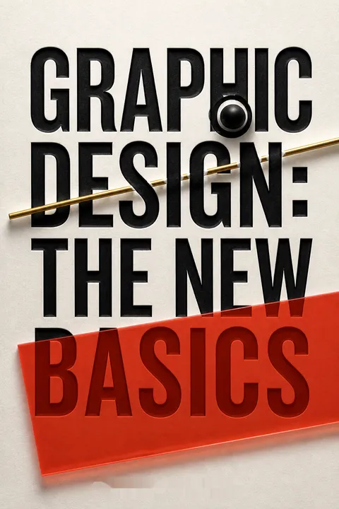
Graphic Design: The New Basics is both a visual reference and an argument about how designers learn to think. Its central claim is that complex, resonant work can grow from elementary visual relationships, but only when those relationships are tested in context. The book returns to modernist design education, especially its attention to point, line, plane, grids, and perceptual structure, while rejecting the idea that a formal vocabulary dictates universal meaning. A grid can describe arrangement; it cannot decide what an arrangement means to every viewer.
That distinction helps the book address a central tension in contemporary practice. Widely available software makes it easier to adjust color, transparency, scale, and layers, yet ease of operation can crowd out the slow work of developing an idea. Formstorming answers with disciplined exploration rather than a mystical account of inspiration. Its exercises make visual thinking tangible: generate many versions, compare them, impose limits, change variables, and observe what the system produces. The examples, largely drawn from student projects, make these processes visible instead of presenting design as the effortless arrival of a polished result.
The book's breadth is also its challenge. A reader encounters perception, typography, color, grids, pattern, diagrams, and motion as interrelated tools, not as isolated recipes. Their value depends on knowing when to use them and what message they serve. A strongly structured layout can clarify information, but visual order alone does not guarantee accessibility or truth. A diagram can reveal relationships while concealing assumptions about the data. Color can be specified precisely and still be interpreted differently across contexts.
The most durable lesson is therefore not that every designer should follow one visual grammar. It is that formal choices deserve conscious testing. Structure supplies a shared means of making and discussing work; context, audience, and individual interpretation keep that structure alive. The book equips readers to move between the two, using rules to build possibilities without mistaking the rules for the finished design.
Review Summary
Graphic Design: The New Basics receives mixed reviews. Many find it a good introduction to graphic design fundamentals, praising its visual examples and clear explanations. Some appreciate its focus on basic principles and find it inspiring. However, others criticize it for being too basic, lacking depth, or using confusing language. The book's use of student work as examples is both praised and criticized. Some reviewers note it's best suited for beginners or as a class textbook, while experienced designers may find it less useful.
People Also Read


Glossary
Formstorming
structured visual explorationA process for developing visual solutions through focused research, repeated making, comparison, and revision. Rather than stopping at an obvious first idea, the designer explores a subject through multiple forms and methods, then selects and develops the strongest directions. Exercises can include making many interpretations of one subject, keeping daily design studies, or working through a designed persona.
Point, Line, Plane
basic visual elementsThree foundational elements used to describe visual form. A point marks a position, a line connects points or records the path of a moving point, and a plane is a flat area extending in height and width. Designers combine and transform them to make shapes, textures, images, patterns, diagrams, and typographic arrangements.
Gestalt Principles
rules of visual groupingPrinciples describing common ways people organize visual information into groups and wholes. The book discusses simplicity, similarity, proximity, closure, continuity, and symmetry. Designers can use these tendencies to make a composition easier to read or to create ambiguity that asks viewers to resolve how separate marks relate.
Figure/ground
form and surrounding spaceThe relationship between a visual form that stands out, called the figure, and the space or material around it, called the ground. The ground can remain a background, compete with the figure, or alternate with it in perception. Designers use these relationships to create emphasis, balance, ambiguity, and active negative space.
Modularity
fixed units in a systemA design approach that builds larger forms from repeated, fixed elements. A module may be a pixel, a grid cell, or a standard physical component. Keeping units consistent limits some choices while enabling many combinations, helping designers create related forms across an alphabet, pattern, layout, or set of objects.
Transparency
overlapping visible surfacesA condition in which two or more surfaces or images can be perceived through one another. In graphic design, transparency may be literal, produced by adjusting an image's opacity, or simulated by arranging opaque forms so that underlying elements remain visible. It can clarify relationships, combine ideas, or create complex layered compositions.
RGB
additive screen colorA color model based on red, green, and blue light. It is used for screen displays, where different intensities of the three colors combine to produce other colors. When all three are at full strength, the result is white; when no light is emitted, the result is black.
CMYK
four-color printing modelA subtractive color model used in common printing processes. Its four components are cyan, magenta, yellow, and black. Printed colors result from inks absorbing and reflecting light, so their appearance differs from colors generated by screen light. Translation between CMYK and RGB is imperfect and depends on printing and viewing conditions.
Style frame
visual guide for animationA designed still image that establishes the intended visual character of an animation or other motion project. It can show the project's typography, colors, patterns, illustrations, and photographic elements. Along with a storyboard, a style frame helps plan the work and communicate its intended appearance before full production.
FAQ
What is "Graphic Design: The New Basics" by Ellen Lupton and Jennifer Cole Phillips about?
- Contemporary design fundamentals: The book is a comprehensive guide to the core principles of two-dimensional graphic design, updated for the digital age.
- Visual language and form-making: It explores the building blocks of visual communication—such as point, line, plane, color, texture, and hierarchy—through both theory and practical exercises.
- Bridging tradition and technology: The authors connect classic modernist design education (like the Bauhaus) with current digital tools and global design practices.
- Student and professional examples: The book is richly illustrated with student work from MICA and professional projects, making abstract concepts tangible and relatable.
Why should I read "Graphic Design: The New Basics" by Ellen Lupton and Jennifer Cole Phillips?
- Essential for beginners and pros: Whether you’re a student, educator, or practicing designer, the book distills complex design concepts into accessible, actionable insights.
- Hands-on learning: It offers practical exercises and real-world examples that encourage experimentation and creative problem-solving.
- Updated for digital realities: The second edition addresses new universals in design, such as transparency, layering, and modularity, reflecting the impact of software and global culture.
- Global and diverse perspective: The book features work from a wide range of cultural backgrounds, reflecting the interconnected nature of contemporary design.
What are the key takeaways from "Graphic Design: The New Basics"?
- Master the basics: Understanding elements like point, line, plane, color, texture, and hierarchy is foundational to all graphic design.
- Experimentation is crucial: The book emphasizes "formstorming"—structured visual experimentation—as a path to innovation and deeper understanding.
- Context matters: Design is not just about form, but about creating meaning within specific cultural, technological, and social contexts.
- Digital tools as enablers: Software has made concepts like layering and transparency universally accessible, but designers must still think critically and creatively.
What is "formstorming" in "Graphic Design: The New Basics" and how can I use it?
- Definition: Formstorming is a set of structured techniques for generating multiple visual solutions to design challenges, moving beyond obvious or cliché ideas.
- Iterative process: It involves exhaustive iteration, synthesis, revision, and representation, pushing designers to explore a subject from many angles.
- Practical exercises: The book includes exercises like "One Hundred Iterations" and "Dailies" to help designers dig deeper and develop discipline.
- Unlocking creativity: Formstorming helps break creative blocks and leads to more original, nuanced, and compelling design outcomes.
How does "Graphic Design: The New Basics" by Ellen Lupton and Jennifer Cole Phillips explain the elements of design (point, line, plane)?
- Point: Marks a position in space; can be a dot, a letter, or any small element that draws attention.
- Line: A series of points; can be straight, curved, thick, thin, continuous, or broken, and is used to connect, divide, or guide the eye.
- Plane: A flat surface created by lines or filled areas; planes can be solid, textured, transparent, or layered to create depth and structure.
- Interaction: All complex designs are built from the interaction of these basic elements, forming images, patterns, diagrams, and typographic systems.
What are the "Gestalt Principles" discussed in "Graphic Design: The New Basics" and why are they important?
- Perception and grouping: Gestalt principles explain how humans naturally group visual elements based on similarity, proximity, closure, continuity, symmetry, and simplicity.
- Figure/ground relationships: The book emphasizes the importance of balancing positive and negative space to create clear, dynamic compositions.
- Practical application: Understanding these principles helps designers create logos, layouts, and interfaces that are both visually appealing and easy to understand.
- Encouraging ambiguity: Designers can also use Gestalt principles to create visual tension and surprise, prompting viewers to engage more deeply with the work.
How does "Graphic Design: The New Basics" approach color theory and its application in design?
- Color as communication: Color is used to convey mood, highlight information, and create visual harmony or contrast.
- Basic theory: The book covers the color wheel, primary/secondary/tertiary colors, complementary and analogous schemes, and the impact of hue, saturation, and value.
- Cultural context: It discusses how color meanings shift across cultures and contexts, and how designers must be aware of these nuances.
- Digital and print models: The book explains additive (RGB) and subtractive (CMYK) color systems, and how color is managed across different media.
What is the role of hierarchy in design according to "Graphic Design: The New Basics"?
- Visual order: Hierarchy organizes information by importance, guiding the viewer’s eye through scale, color, placement, and spacing.
- Typographic hierarchy: The book provides classic and creative examples of how to structure text for clarity and impact, from tables of contents to menus and packaging.
- Complexity and clarity: Effective hierarchy makes complex information accessible, whether in print, on screen, or in three-dimensional space.
- User control: In digital and interactive design, hierarchy must be flexible, allowing users to navigate and access information in multiple ways.
How does "Graphic Design: The New Basics" address the concepts of layering and transparency in modern design?
- Layering: Layers are overlapping components—images, text, color fields—that can be manipulated independently in both print and digital media.
- Transparency: Transparency allows multiple surfaces to be visible at once, creating depth, complexity, and new relationships between elements.
- Digital tools: Software like Photoshop and Illustrator make layering and transparency accessible to all designers, not just professionals.
- Meaning and composition: The book explores how these techniques can be used thematically (to suggest synthesis or conflict) and compositionally (to soften, emphasize, or separate elements).
What is modularity and how is it used in "Graphic Design: The New Basics"?
- Definition: Modularity involves creating designs from fixed, repeatable units (modules), such as pixels, blocks, or standardized components.
- Creative constraint: Working within modular systems encourages innovation by limiting some variables and freeing others.
- Applications: The book shows modularity in type design, signage, architecture, and pattern-making, demonstrating its versatility.
- System thinking: Modularity is essential for designing flexible, scalable systems—like grids, interfaces, and branding—that can adapt to different contexts.
How does "Graphic Design: The New Basics" by Ellen Lupton and Jennifer Cole Phillips integrate time and motion into design education?
- Implied and literal motion: The book covers how to suggest movement in static images (through diagonals, cropping, and dynamic composition) and how to design for animation and interactivity.
- Storyboards and style frames: It introduces tools for planning motion graphics, such as storyboards (for sequencing) and style frames (for visual tone).
- Change over time: Designers learn to animate not just position, but also scale, color, transparency, and layering, using both traditional and digital techniques.
- Interactive design: The book addresses how motion and behavior are integral to user experience in digital products, requiring designers to think beyond static layouts.
What are the best quotes from "Graphic Design: The New Basics" and what do they mean?
- "Design is the conscious effort to impose a meaningful order." —Victor Papanek
This quote underscores the designer’s role in organizing information and visual elements to create clarity and purpose. - "Formstorming is an act of visual thinking—a tool for designers to unlock and deepen solutions to basic design problems."
It highlights the importance of structured experimentation in moving beyond obvious solutions to achieve innovation. - "Every drawing can be understood as a motion study since it is a path of motion recorded by graphic means." —László Moholy-Nagy
This quote connects the act of drawing to the concept of time and movement, reminding designers that even static images have dynamic qualities. - "A well-defined constraint can free up the thought process by taking some decisions off the table."
The book encourages embracing limitations (like modularity or grids) as a way to foster creativity and focus. - "All colors are the friends of their neighbors and the lovers of their opposites." —Marc Chagall
This poetic statement encapsulates the relational nature of color in design, where harmony and contrast are both essential.
About the Author
Other books by Ellen Lupton

Download PDF
Download EPUB
.epub digital book format is ideal for reading ebooks on phones, tablets, and e-readers.








