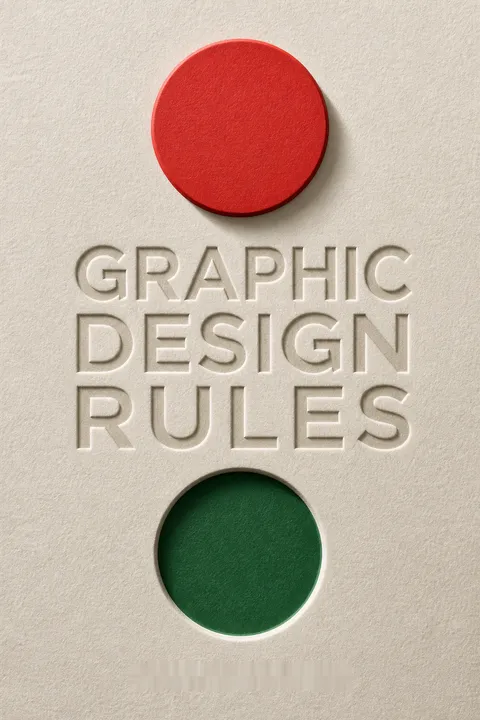


Key Takeaways
Learn the conventions deeply enough to break them on purpose
Craft creates freedom. Adams presents design as a balance between close attention to detail and openness to unconventional ideas. A designer needs to know how typography, composition, color, and production work before bending their usual rules. He describes using inferior paper to make a project feel authentic, and choosing clashing typefaces simply because the concept called for them. Such choices may delight one audience and alienate another, so surprise alone is not a reason to break convention.
Intent is the test. The book's rules are starting points for reliable communication, not laws that make every solution look alike. Strong craft matters because an original concept still has to be executed clearly, carefully, and with attention to the viewer.
The useful distinction is not between conventional and unconventional design, but between deliberate and accidental choices. A rule is valuable when it helps a designer predict what a change will do to legibility, tone, or production. That turns expertise into informed risk-taking rather than rule worship. The standard also needs to remain audience-centered: a designer's intent cannot rescue a choice that the viewer experiences as confusing or irrelevant. Good experimentation makes its purpose perceptible, even when the result is strange.
Choose type for the reader and task, not for novelty
Typography carries the message. A typeface has a voice, but its first job is to serve the content and conditions of reading. Comic Sans, designed for friendly computer interfaces, became a poor default for everything from business materials to signage. Its overfamiliarity can also make it useful for irony, provided the joke is clear to the audience. Classic faces often outlast fashionable ones, while a historical reference can help identify an appropriate family, such as using a refined serif for extended reading.
Readability sets the baseline. Limit type choices, use real bold and italic styles rather than distorting letters, and check spacing at headline sizes. Yet illegibility can be a valid expressive choice in work whose audience expects visual provocation. A government information leaflet has different obligations from an experimental magazine.
Typography is both language and visual texture, so the right choice depends on what the reader is being asked to do. Familiar letterforms can reduce effort when someone needs directions or sustained information; unusual forms can signal attitude when discovery is part of the experience. The important question is whether difficulty is communicating something or merely displaying the designer's taste. The book's exceptions prevent its advice from collapsing into rigid minimalism, though real audiences are diverse, and accessibility needs should be considered before sacrificing legibility.
Give every page a clear route through its information
Structure makes complexity usable. Visual hierarchy is the ordering of elements by importance so readers can tell where to begin and what to notice next. Size, position, color, and type weight can establish that order, but changing every feature at once creates noise. A modular grid, a layout structure divided into aligned rows and columns, helps varied elements feel related without requiring them to be identical.
Space also directs attention. White space separates groups and gives the eye a path through the page. For a long book, repeating exactly the same arrangement can become monotonous, so vary image scale and placement while preserving navigation. Design facing pages as a pair, check layouts at actual size and thumbnail size, and leave room for folios so readers can find their place.
A page behaves like a small information system: arrangement tells readers what belongs together and which decision to make first. This is why a grid can feel reassuring even when it is invisible. The same logic applies to interfaces and public information, where consistent placement helps people act without relearning the structure. But structure should support the content, not flatten it. Varying rhythm can keep attention alive, while a grid that dictates every choice risks making distinct material feel mechanically uniform.
Treat color as context, culture, and print chemistry
Color is never isolated. A hue changes in appearance depending on its surroundings, lighting, and the viewer's associations. Meanings also differ across cultures: the book notes that purple carries a mourning association in Thailand, while yellow has distinct associations in Japan, the United States, and Egypt. Research the audience and competitors, and build palettes from purposeful references such as landscapes or paintings rather than relying on software's default swatches.
Output changes the choice. Screens use additive RGB light, while four-color printing uses subtractive CMYK inks. RGB can display colors that CMYK cannot reproduce, a limitation described as the color gamut. Profiles help manage color between devices, but printed proofs on the intended paper remain essential. Strong or unusual combinations can work when used confidently and for a clear reason.
Color decisions combine perception, learned meaning, and physical reproduction. Treating those as separate questions helps a team avoid a common mistake: debating whether a color is attractive before asking whether it will reproduce reliably or make sense to its audience. The book is especially useful in showing that color theory should inform judgment without dictating it. Cultural associations are patterns, not guarantees about individuals, and color symbolism should be checked with the actual people and places a project intends to reach.
Choose images that add meaning, then treat their makers fairly
An image should earn its place. A technically perfect photograph is not automatically the best choice; the image that creates the right response may be more valuable. Stock photography can save money, but widely used images can make a project feel interchangeable. Look for original imagery when the budget allows, and assess client-supplied pictures honestly. Offer alternatives with a clear explanation rather than silently accepting a weak image or dismissing the client's contribution.
Images carry implications. A picture's subject, crop, and context affect what it says, including its political meaning. Text and image should add information to each other instead of repeating the obvious. Respect photographers' and illustrators' work: credit them when appropriate, invite their input, and ask before changing an illustration. Avoid treating filters as a cure for poor source material.
Images often make an argument before readers reach the words. Their framing can signal who matters, what is normal, and what deserves attention, so image selection is part of the ethical and editorial work of design. The advice to pair text and image so each contributes something distinct is also a strong test for redundancy. At the same time, budget and rights shape what is possible. A designer's responsibility includes finding the best honest solution within those constraints, not pretending every project can commission bespoke imagery.
Design for paper, presses, screens, and the ways people use them
The final medium has rules. A layout that looks crisp on a monitor may fail in print. For quality printed images, the book gives 300 pixels per inch as a common target, especially alongside a 150 lines-per-inch halftone screen. Enlarging an image reduces its effective resolution. Full-bleed artwork generally needs at least 3 millimeters of extra image beyond the trim edge, so minor cutting shifts do not leave white slivers.
Production belongs in the design. Ask the printer about paper, color profiles, binding, and schedules early. A hard proof on the intended stock reveals problems that a screen or ordinary laser print may hide. For packages, build a full-size mock-up to test folds, seams, readability, and fit. For websites, check multiple screen proportions and start with the small phone layout rather than assuming a desktop design will simply shrink.
Production knowledge is not a technical afterthought. It determines whether a design survives contact with its medium, from a spine that swallows an image detail to a color that shifts on a different stock. This resembles engineering design, where a concept must function under real material constraints, not only in a rendering. The numerical standards are useful defaults, but they are not universal guarantees: printer, paper, viewing distance, and process all matter. Early collaboration with production specialists turns those variables into design inputs rather than expensive surprises.
Turn the brief into shared decisions before designing
Agreement prevents rework. A written brief should establish the project's purpose, priorities, audience, and constraints. Ask follow-up questions rather than assuming the client has already supplied everything needed. Confirm deliverables, costs, responsibilities, and timing in writing. The book's cautionary story about a designer who receives no direction, presents a concept, and is told to start over shows how enthusiasm cannot substitute for agreement.
Listen, then interpret. Clients know their organizations and audiences in ways a designer may not, so their concerns deserve attention. But the client's requested format may not solve the underlying problem. Clarify what outcome they need, explore their suggestion, and present a stronger alternative in terms of that outcome. Get approval on the visual direction before polishing the final work, and ask about color preferences before a presentation is derailed by an avoidable objection.
A brief is a coordination tool, not bureaucratic paperwork. It makes tacit assumptions visible: what success means, who decides, and what changes cost. That protects the relationship as much as the schedule. The designer's role is also more than literal execution, since clients may prescribe a format before the problem has been diagnosed. The productive balance is informed challenge without professional condescension. Client knowledge and design expertise are different kinds of evidence, and a good solution draws on both.
Find the idea before decorating it with software
Concept comes first. The visual treatment presents an idea; it cannot make a weak idea strong by itself. Adams recommends beginning with research and sketches instead of immediately choosing fonts, grids, and effects on a computer. Looking at design annuals too early can crowd out original thinking by filling the mind with solutions other people have already made. Broader reading and research beyond a quick web search can reveal references and connections that a narrow search misses.
Polish cannot repair the premise. If a designer is repeatedly nudging elements by tiny amounts without improving the composition, the underlying concept may be the problem. Return to the brief and reconsider the idea before adding decorative layers or effects. Research should come from credible, varied sources, and borrowing another designer's solution is not a substitute for doing the interpretive work.
This is an argument about sequencing: decide what the work needs to say before deciding how it should look. Sketching keeps early thought cheap and flexible, while software can make premature choices feel finished simply because they are polished. The warning against design references is best read as a timing rule, not a ban on learning from the field. Exposure is essential to expertise, but references are more generative when used to deepen a question than when treated as a menu of ready-made answers.
Build a team whose strengths extend beyond your own
Good work is collaborative. Designers may be capable of writing, photographing, or illustrating, but a specialist can often bring greater skill and a fresher perspective. Build a team with complementary abilities rather than several people who solve every problem in the same way. The book recommends listening to photographers and illustrators, crediting their work, and inviting their ideas; their expertise can improve a project in ways a designer working alone may miss.
Collaboration needs respect. Delegate tasks when another person is better placed to do them, and agree on responsibilities before sharing a project. Treat colleagues well regardless of status, since professional relationships change over time. A mentor can help a designer learn from experience, and experienced designers should be ready to offer guidance in return. Collaboration is not surrendering the idea; it is giving the idea more capable hands.
A complementary team increases the range of possible solutions because different specialists notice different problems. This is more than efficiency: it changes the quality of the questions being asked. The key is to coordinate expertise without treating collaborators as interchangeable production tools. Clear roles, credit, and permission matter because creative work is also relationship work. A team can still develop blind spots if everyone shares the same assumptions, so complementary craft should be paired with genuine openness to dissent.
Protect creative work with clear terms, cash flow, and rest
Professionalism sustains the work. Agree on fees before starting, question budgets that cannot support the requested scope, and invoice regularly, including at project milestones. Free work can undermine the value of design, especially when other contributors are being paid. Estimate time honestly and leave room for production delays, client changes, and unexpected problems. When an error occurs, report it quickly so there is time to limit the damage.
Boundaries protect judgment. Design work can expand to occupy every available hour, so time away is part of a sustainable practice, not a lack of commitment. Set clear expectations about availability, keep reliable backups of completed work, and do not accept a client relationship that depends on disrespect. A good accountant, a mentor, and trusted collaborators help protect the business that supports the creative work.
The book treats business habits as part of design craft, a valuable correction to the idea that creative excellence can be separated from payment, scheduling, and care. Reliable invoicing and backups are mundane, but they protect both livelihood and client trust. Boundaries also preserve attention, which is a finite resource in detail-intensive work. The tension is that creative services sometimes require flexibility; healthy boundaries do not mean inflexibility, but explicit agreements about response times, scope, and what a change requires.
Analysis
Graphic Design Rules is a reference book organized as a sequence of practical dos and don'ts, but its deeper structure is an argument about judgment. The rules range from minute typographic decisions to client relationships, image ethics, color reproduction, and print production. That breadth makes a chapter-by-chapter summary less useful than a set of principles showing how these decisions connect.
The central principle is that design is communication made tangible. Typography affects whether language can be read; layout controls the order in which information is encountered; color shapes both attention and interpretation; production determines whether the intended result survives outside the designer's screen. The book's insistence on craft is therefore not merely aesthetic conservatism. It is a claim that details matter because they shape the reader's experience and the credibility of the message.
Its apparent contradictions are productive. Legibility is usually essential, but experimental work may deliberately resist it. Grids create coherence, yet a layout may need to escape one. Color conventions are useful, but not universal. These tensions make the book strongest when its rules are treated as tested defaults, each subject to audience, purpose, medium, and context. They become less convincing when a specific preference is presented as though it applies to every project. A technically informed exception is not the same as an arbitrary violation.
The book also makes design a social and operational practice. A clear brief, fair payment, respectful collaboration, and early printer involvement are not peripheral concerns; they determine what can be made and whether it can be delivered well. Its most durable lesson is a method: understand the problem, choose the right tools and constraints, execute carefully, and evaluate the result from the viewer's position. Software and style are means, not substitutes for that judgment.
Review Summary
Graphic Design Rules receives generally positive reviews, with an average rating of 3.89 out of 5. Readers appreciate its comprehensive coverage of design principles, accessible writing style, and practical advice for both beginners and experienced designers. The book's structure of 365 tips is praised for its conciseness, though some find it inconsistent or repetitive. Many readers find it a valuable reference guide, particularly for typography and layout. Some criticism is directed at occasional contradictions, overuse of sarcasm, and focus on specific software tools.
People Also Read




Glossary
Leading
Space between linesLeading is the vertical distance between lines of type. The term comes from strips of lead once placed between rows of metal type. Too little space can make a paragraph feel crowded, while too much can interrupt the reader's movement from one line to the next. The appropriate amount depends on the typeface, size, and layout.
Kerning
Spacing between letter pairsKerning is the adjustment of space between particular pairs of characters to make their spacing appear balanced. A typeface may include built-in kerning pairs, but large headlines and unusual combinations often need manual correction. It differs from tracking, which adjusts spacing across a word, line, or larger block of type.
Tracking
Spacing across textTracking is the adjustment of letter spacing across a continuous range of text, such as a word, line, or paragraph. It can help improve the appearance of a setting or resolve awkward line breaks, but excessive tightening or loosening makes words harder to recognize and read. It differs from kerning, which adjusts individual character pairs.
Modular grid
Rows and columns for layoutA modular grid divides a page into aligned horizontal and vertical units. Designers can place text, images, and other elements across one or more modules, creating a consistent structure for varied content. The grid need not appear in the finished work; its purpose is to help the composition feel organized and flexible.
Visual hierarchy
Order of visual importanceVisual hierarchy is the arrangement of information so viewers can identify what matters most and what to examine next. Designers establish it through such choices as position, scale, color, and type weight. A clear hierarchy helps readers navigate; competing emphasis can make every element appear equally important and leave the viewer unsure where to begin.
Color gamut
Range of reproducible colorsA color gamut is the range of colors a particular device or color model can display, capture, or reproduce. Screen-based RGB systems can show some vivid colors that four-color CMYK printing cannot reproduce. Understanding gamut limits helps designers make realistic color choices and communicate why a printed result may differ from a screen preview.
Color profile
Instructions for color reproductionA color profile describes how a device or workflow represents color. Applied consistently, profiles help preserve color information as images move between screens, design applications, and printing systems. A profile cannot make every device produce identical color, but it allows color conversions to be managed and helps designers and printers anticipate differences.
Bleed
Artwork beyond the trimBleed is extra image or color that extends beyond the finished edge of a printed page. Printers trim through this area so slight shifts in cutting do not reveal an unprinted white edge. Important text and image details should remain safely inside the trim area, not in the bleed.
Creep
Inward page shift in bindingCreep occurs when folded or gathered pages shift in relation to one another during binding. Inner sheets can protrude beyond outer sheets, and trimming may make their margins narrower. The effect becomes more important as page count and paper thickness increase, so designers account for it when setting margins and placing important content.
Figure-ground relationship
Shape and surrounding spaceThe figure-ground relationship describes how viewers distinguish a main shape from the surrounding area. In a logo, contrast can make the main form clear, while negative space may also create a secondary shape. A familiar example is the arrow formed in the space between the letters in the FedEx wordmark.
Face-ism ratio
Face compared with bodyThe face-ism ratio describes how much of a person's face appears in an image relative to the body. Cropping and framing affect whether a viewer focuses more on a subject's expression and perceived character or on physical appearance. The book discusses gendered patterns in this practice and urges designers to consider what a crop communicates.
Digital Asset Management (DAM)
Cataloging digital filesDigital Asset Management is the organized cataloging of images and other digital files so they can be located and reused. A DAM system may use folders, dedicated software, or image-management tools, often with searchable metadata such as keywords. Consistent organization saves time on large projects and helps preserve useful files for future work.
Download PDF
Download EPUB
.epub digital book format is ideal for reading ebooks on phones, tablets, and e-readers.








