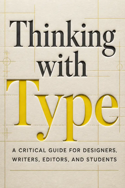


Key Takeaways
Use type to give language a body, not merely a look
A tool, not a catalog. Typography is the practice of shaping language for a particular reader and situation. Its choices affect how words are encountered, not just how they appear. The book moves from the design of individual letters to the organization of text and, finally, the systems that arrange whole pages and screens.
History leaves fingerprints. Movable type made written language reproducible at scale. Early roman letters carried traces of handwriting; later designers pushed toward geometric abstraction, while nineteenth-century advertisers stretched and decorated letters to compete for attention. Digital type revived both systematic construction and handmade irregularity. Each technology changed the available forms, but none made typography neutral or merely mechanical.
Typography is a useful reminder that communication always has a material interface. A voice, a printed page, and a phone screen do not present language in the same way, even when the words match. The historical arc also complicates the idea that clean, plain type is naturally more objective: restraint is itself a designed style with cultural associations. The practical test is not whether a choice looks modern or traditional, but whether its form helps this particular message reach its intended audience.
Choose a typeface for its context, not a supposedly universal personality
Style carries history. Type classifications such as humanist, transitional, and modern describe broad changes in letterform, from calligraphic influence toward sharper contrast and abstraction. These categories help a designer recognize visual traits, but they do not assign a permanent meaning to each face. A typeface’s associations depend on its history, use, and audience.
Match, do not stereotype. Gotham, drawn from lettering at New York’s Port Authority Bus Terminal, became the signature face of Barack Obama’s 2008 campaign. Its utilitarian origins did not dictate a single political meaning; its new context gave it fresh resonance. Historical revivals such as Mrs Eaves likewise reinterpret older forms through contemporary design. Compare a typeface’s proportions and texture with the content and setting before deciding what it communicates.
This is a strong argument against font horoscopes, the habit of claiming that a typeface always means something like trustworthy, elegant, or rebellious. Such shorthand can be useful in brainstorming, but it becomes misleading when treated as a rule. Meaning is relational: a familiar face can signal authority in one setting and parody in another. Audience knowledge matters too. A design that feels warmly historical to one group may look simply old-fashioned to another.
Tune size and spacing for the medium, not the software default
Apparent size varies. Point size measures a typeface’s overall body, but it does not guarantee that two faces will look equally large. The x-height, or height of the lowercase body, strongly affects apparent scale. A face with a large x-height can remain clear when small; another may look delicate at the same point size. Printed text commonly falls around 9 to 11 points, while a software default of 12 points can look oversized on a printed page.
Design for the output. Optical sizes are versions of a typeface adjusted for different scales. Metal type designers cut separate designs for small and large sizes; small versions needed sturdier details, while display versions could be finer. Digital fonts may provide comparable styles. Screen, paper, distance, and surrounding elements all alter how large type seems.
The distinction between nominal size and perceived size parallels a broader principle in interface design: a numerical setting is not the same as a user experience. Testing a page at its actual reading scale is more reliable than judging it enlarged on a designer’s monitor. Legibility is also not a single measurable property of a font. Familiarity, contrast, line length, visual ability, and reading conditions all matter, so typographic judgment benefits from real readers rather than software defaults alone.
Let negative space organize reading as deliberately as printed marks do
Gaps carry structure. Typography depends on the spaces between letters, words, lines, and paragraphs. Leading is the distance from one line’s baseline to the next. Too little can cause ascenders and descenders to collide; too much can make each line feel detached from the paragraph. Kerning adjusts the gap between a particular pair of letters, while tracking adjusts spacing across a group.
Alignment changes the voice. Justified text creates even edges but can produce distracting gaps when columns are narrow. Flush-left text preserves regular word spacing, though its ragged edge needs attention. Centered and flush-right settings bring different formality and emphasis. Even quotation marks affect the edge of a text block: hanging them into the margin can preserve a cleaner alignment.
Space is not empty in the sense of being inactive. In visual perception, proximity helps people decide which marks belong together, so a small adjustment can change whether a heading feels connected to its paragraph or a caption to its image. Yet sparse layouts are not automatically clearer. Dense information can support comparison when its structure is well made. The designer’s task is to use spacing to reveal relationships, not to apply a universal preference for either openness or compression.
Give readers a visible hierarchy and several ways into dense text
Make structure scannable. A typographic hierarchy distinguishes levels of information through cues such as size, weight, color, placement, and spacing. Consistent cues help readers find a headline, subsection, caption, or page reference without treating every line as equally important. Too many signals create noise; a restrained set, applied consistently, can make even a long list easier to navigate.
Reading is not always linear. Roland Barthes distinguished the closed, finished work from the text understood as a network of references that readers actively interpret. Book features such as indexes, headings, and footnotes already let people enter and leave a sequence at different points. Web links, search, and captions extend those routes. Design can support close reading, quick scanning, or a search for one useful fact.
Hierarchy is both a convenience and an editorial decision. Whatever receives the largest type or the most prominent position is being declared important, so the visual system quietly expresses priorities. That makes hierarchy a tool for clarity, but also a place to question whose needs shape the page. Multiple routes through material can help different readers, though too many competing routes make orientation harder. A successful design offers choice without disguising the main structure.
Build grids as adaptable programs, not cages for every element
A grid sets relationships. A typographic grid is a system for organizing text, images, and data within a page or screen. Early printed books used single-column pages, two-column layouts, and complex arrangements for multiple languages. In the early twentieth century, avant-garde designers exposed the mechanical grid beneath letterpress, while postwar Swiss designers developed systematic grids for consistent, varied design.
Let content test the system. A modular grid divides a page into repeatable horizontal and vertical units. It can make a publication coherent while allowing different elements to occupy different amounts of space. A table also uses a grid, but heavy lines around every cell can obstruct comparison. The golden section, a proportion used in some layouts, is one possible tool, not a rule that should overrule content or practical page sizes.
A grid can make collaboration and repetition easier because people can place new material within shared constraints. Its deeper value is not tidiness, but the ability to preserve relationships as content changes. Still, systems are not innocent: a rigid template can suppress unusual material or make unequal items look equivalent. The most useful grid is therefore inspectable and revisable. It should explain why elements belong together, while leaving room for a deliberate break when the content requires one.
Make structure accessible before styling the page
Separate meaning from appearance. Structural hierarchy labels what content is, such as a heading, paragraph, or emphasized phrase, rather than describing only how it looks. On the web, semantic markup helps browsers, search tools, and assistive technologies interpret that structure. A page can then receive different visual styles without losing the relationships among its parts.
Design for more than sight. Screen readers turn a page into spoken language, so source order, meaningful image descriptions, and clear headings matter. A skip-to-content link can let users bypass repeated navigation. The visible layout and the underlying order should work together, since some people use assistive tools while also seeing the page. Icons are not automatically clearer than words, and an image often needs a textual explanation.
Accessibility is not a finishing layer added after visual design. It tests whether the content’s organization survives when the preferred display changes. That is a useful discipline even for readers without disabilities: sensible source order and clear labels make material easier to repurpose and maintain. But semantic markup alone cannot guarantee usability. The quality of descriptions, interaction, and navigation still needs testing with the people and tools the design is meant to support.
Proofread type as a production process, not a last-minute glance
Different passes catch different failures. Developmental editing considers a work’s larger argument and structure. Copy editing checks consistency, grammar, and wording. Proofreading happens after the text is designed and typeset, when new errors can appear. A printer’s error is a production mistake; an author’s alteration changes approved content, and may create extra labor and cost. Keeping one approved proof and tracking revisions helps assign responsibility.
Check the small marks. Remove double spaces, distinguish apostrophes and quotation marks from straight prime marks, and use the correct dash or hyphen for the job. Review page breaks, line endings, and corrections after changes are made. Each revision can introduce a fresh problem, so a final pass should inspect the actual designed pages, not just the original manuscript.
The workflow treats accuracy as a property of the whole production chain, not merely the writer’s attention. That idea transfers readily to collaborative work: clear handoffs, a single authoritative version, and explicit approval points reduce ambiguity about what changed and who must check it. The stages should not become bureaucratic rituals, however. A proof is useful only if someone reads it carefully, and late corrections deserve judgment about whether their benefit outweighs the risk of disrupting a settled layout.
License fonts carefully, and choose tools with the characters your readers need
Know what is being licensed. A typeface is the visual design of letters; a font is the digital software that stores and outputs that design. Licenses commonly restrict copying or altering font software, even when they permit a designer to modify letter outlines for a logo. Free fonts vary in quality and terms, while open font licenses can allow modification and redistribution under stated conditions.
Check the character set. OpenType fonts can hold large collections of characters and alternate forms in one file. Some expanded sets support accented letters and characters needed for languages beyond English. Before choosing a font, check that it contains the glyphs the project requires and that its license permits the intended use. The book treats such checks as part of responsible design, not administrative trivia.
Typography depends on a working ecosystem of designers, foundries, users, and readers. Licensing recognizes that fonts are crafted software, while open distribution can widen access and invite contributions. Neither approach automatically serves every community: a nominally free font may lack needed characters, and a well-made commercial font may be inaccessible to a small project. The practical question is both legal and linguistic: can the design be used as intended, and can the people addressed actually read their language?
Analysis
Thinking with Type is a practical guide organized around a conceptual progression: letter, text, and grid. That structure matters. It shows that typography is not a bag of font preferences but a chain of decisions, from the shape of a character to the routes through a document and the larger system that holds it together. Historical examples make each technical convention look contingent rather than inevitable. Roman forms, industrial display faces, geometric modernism, and digital lettering arise from particular tools and cultural demands.
The book’s most useful tension is between order and expression. Typography needs conventions to remain legible and navigable, yet those conventions can be bent to make meaning visible. A grid can coordinate many contributors, but it can also impose a false uniformity. A clear hierarchy can help readers find information, but it assigns prominence. The designer is therefore not simply decorating content. Design choices structure attention and interpret language.
The account of digital media is especially valuable when it refuses easy technological determinism. A screen is not inherently hostile to sustained reading, and a visual icon is not necessarily more universal than a word. Expectations, interface habits, and the organization of content shape use alongside the display itself. The argument also makes accessibility a structural design issue: content must retain meaning when its visual arrangement is translated into another mode.
Some discussions are anchored in technologies and web practices current to the book’s 2010 revised edition, so particular production examples are historically situated. The durable lesson is the method: inspect what a tool makes easy, what its defaults conceal, and which readers its conventions serve. That method applies beyond typography to any designed system where information must remain legible, adaptable, and accountable to its audience.
Review Summary
Thinking with Type is highly regarded as an informative introduction to typography, praised for its visual appeal and practical insights. Many readers found it helpful for understanding design principles and appreciating typography in everyday life. The book's organization into sections on letters, text, and grids was well-received. While some experienced designers found it basic, most beginners and enthusiasts appreciated its accessible approach. A few critics noted errors or found it superficial, but overall, it's recommended as a valuable resource for those interested in typography and design.
People Also Read

Glossary
Typeface
Letterform designA typeface is the visual design shared by a set of letters, numerals, and other characters. It describes how the forms look, rather than the particular file used to install and output them. A single typeface can be distributed in different digital formats and may include multiple weights, styles, or character sets.
Font
Type delivery softwareA font is the software or, historically, the collection of physical pieces that makes a typeface usable in composition and printing. In digital typography, font files contain the instructions and character outlines needed to display or output letterforms. Licensing typically applies to this software, which is distinct from the visual design of the typeface.
X-height
Lowercase body heightThe x-height is the height of a lowercase letter’s main body, measured from the baseline and excluding ascenders and descenders. It influences how large a typeface appears at a given point size and affects its texture and space use. Typefaces with different x-heights can look noticeably different even when set at the same nominal size.
Optical sizes
Scale-specific font designsOptical sizes are versions of a typeface adjusted for particular output scales. Small text designs may use sturdier strokes and more open details to remain clear; display designs can use finer features that show well when enlarged. In metal type, separate designs were cut for different sizes. Digital families can include corresponding size-specific styles.
Kerning
Pair-specific letter spacingKerning adjusts the space between a particular pair of letters. Some combinations appear uneven because their shapes leave conspicuous gaps or crowd one another. Digital fonts can include kerning tables that specify adjustments for such pairs, and layout programs may also calculate spacing optically. Designers can make further manual adjustments when needed.
Tracking
Spacing across letter groupsTracking is an adjustment to the overall spacing across a word, line, or larger group of letters. Positive tracking opens the spacing; negative tracking tightens it. It is often used for headings or capitals, while excessive tracking in lowercase text can disrupt the natural connections among letters. Tracking differs from kerning, which addresses an individual pair.
Leading
Baseline-to-baseline distanceLeading is the distance between the baselines of successive lines of type. The name comes from the strips of lead placed between lines in metal typesetting. More leading opens a text block; less leading makes it denser, sometimes causing ascenders and descenders to collide. In digital layout, leading is usually specified as a numerical line-spacing value.
Work
Closed, finished textIn Roland Barthes’s contrast, a work is a bounded literary object presented as complete and stable, with an identifiable author and a fixed edition. Typography traditionally supports this impression through orderly pages, consistent navigation, and a finished text. The concept is used in contrast with text understood as open to interpretation and connection.
Text
Open web of meaningsIn Barthes’s specialized use, text is not simply a printed block of words. It is an open network of references, cultural languages, and interpretations activated by reading. This idea shifts attention from a work’s fixed form and authorial control toward the reader’s role in making meaning. Hyperlinks and other non-linear structures make this model especially vivid.
Typographic grid
Layout organizing systemA typographic grid is a system of divisions and alignments used to organize text, images, and data within a page, screen, or other space. It can range from a single text column to a complex modular structure. A grid provides repeatable relationships, but it should respond to the material rather than dictate every placement.
Structural hierarchy
Semantic content organizationStructural hierarchy identifies what parts of a document are and how they relate, such as titles, headings, paragraphs, and captions. On the web, semantic markup records these roles separately from their visual styling. This lets different devices and assistive technologies interpret the content structure even when the appearance changes.
FAQ
What's "Thinking with Type" about?
- Comprehensive guide: "Thinking with Type" by Ellen Lupton is a comprehensive guide to typography, focusing on the use of type in design, writing, and editing.
- Structure and content: The book is divided into three main sections: Letter, Text, and Grid, each exploring different aspects of typography.
- Historical and practical insights: It provides both historical context and practical advice, making it suitable for designers, writers, editors, and students.
- Visual examples: The book is rich with visual examples and exercises to help readers understand and apply typographic principles.
Why should I read "Thinking with Type"?
- Foundational knowledge: It offers foundational knowledge for anyone interested in typography, whether you're a beginner or a seasoned professional.
- Practical applications: The book provides practical applications and exercises that can be directly applied to real-world design projects.
- Cultural and theoretical context: It explores the cultural and theoretical issues that influence typographic design, enhancing your understanding of the field.
- Inspiration and creativity: The book is designed to inspire creativity and encourage readers to experiment with type in innovative ways.
What are the key takeaways of "Thinking with Type"?
- Typography as a tool: Typography is a tool for shaping content and giving language a physical form, crucial for effective communication.
- Importance of spacing: Spacing is as important as the letters themselves, affecting readability and the overall aesthetic of a design.
- Hierarchy and alignment: Establishing a clear hierarchy and choosing the right alignment are essential for guiding the reader's eye and enhancing comprehension.
- Flexibility of grids: Grids are not rigid structures but flexible frameworks that can be adapted to suit different design needs.
How does Ellen Lupton define typography in "Thinking with Type"?
- Typography as a tradition: Lupton describes typography as an ongoing tradition that connects designers across time, emphasizing its historical roots.
- Tool for communication: Typography is a tool for doing things with language, shaping content, and enabling the flow of messages.
- Cultural and functional basis: The book asserts that typography has both a cultural and functional basis, influencing design habits and conventions.
- Elastic system: Typography is presented as an elastic system where rules can be broken to achieve creative and effective design solutions.
What are the main sections of "Thinking with Type" and what do they cover?
- Letter: This section explores the anatomy of letterforms, type classification, and the evolution of typefaces from historical to modern times.
- Text: It focuses on the arrangement of letters into coherent bodies, covering topics like spacing, alignment, and the creation of typographic hierarchy.
- Grid: The grid section examines spatial organization, discussing how grids can be used to structure content and create dynamic layouts.
- Exercises and examples: Each section includes exercises and visual examples to help readers apply the concepts discussed.
What is the significance of spacing in typography according to "Thinking with Type"?
- Crucial for readability: Proper spacing is crucial for readability, affecting how easily text can be read and understood.
- Negative space: The book emphasizes the importance of negative space, which can be as significant as the letters themselves in a design.
- Types of spacing: It covers different types of spacing, including word spacing, line spacing, and tracking, and how they impact the overall design.
- Visual balance: Spacing helps achieve visual balance and harmony in a layout, guiding the reader's eye through the content.
How does "Thinking with Type" address the concept of typographic hierarchy?
- Organizing content: Typographic hierarchy is about organizing content to emphasize certain elements and guide the reader's attention.
- Use of cues: The book discusses using spatial and graphic cues, such as size, style, and placement, to create a clear hierarchy.
- Redundancy in signals: It suggests using redundancy in signals, like combining indents with line breaks, to reinforce the hierarchy.
- Practical examples: The book provides practical examples and exercises to help readers implement effective typographic hierarchies in their work.
What role do grids play in typography as explained in "Thinking with Type"?
- Framework for design: Grids provide a framework for organizing content, helping designers create structured and coherent layouts.
- Flexibility and adaptability: The book emphasizes that grids are flexible and can be adapted to suit different design needs and content types.
- Historical context: It explores the historical development of grids, from classical book layouts to modernist design methodologies.
- Practical application: Readers are encouraged to experiment with grids through exercises, learning how to use them effectively in their projects.
What are some of the best quotes from "Thinking with Type" and what do they mean?
- "Typography is a tool for doing things with language." This quote highlights the functional aspect of typography as a means of shaping and communicating content.
- "Typography is an ongoing tradition that connects you with other designers, past and future." It emphasizes the historical continuity and community within the field of typography.
- "The grid is not a rigid formula but a flexible and resilient structure." This quote underscores the adaptability of grids in design, encouraging creative use.
- "Spacing is as important as the letters themselves." It stresses the significance of negative space in achieving readability and aesthetic balance.
How does "Thinking with Type" approach the history of typography?
- Historical evolution: The book traces the evolution of typography from early typefaces modeled on calligraphy to modern digital fonts.
- Influence of technology: It discusses how technological advancements, like movable type and digital design tools, have shaped typographic practices.
- Cultural impact: The book explores the cultural and artistic movements that have influenced typography, such as the Renaissance and modernism.
- Legacy and innovation: It highlights the balance between preserving typographic traditions and embracing innovation in contemporary design.
What exercises does "Thinking with Type" include to help readers practice typography?
- Modular lettering: Readers are encouraged to create prototype bitmap typefaces using grids, exploring the systematic quality of typography.
- Space and meaning: Exercises focus on using spacing, sizing, and placement to express the meaning of words or ideas visually.
- Alignment and hierarchy: Practical tasks involve experimenting with different modes of alignment and creating typographic hierarchies.
- Grid systems: The book includes exercises on designing with grids, helping readers understand their flexibility and application in layouts.
What is the importance of typographic hierarchy in design as discussed in "Thinking with Type"?
- Guiding the reader: Hierarchy helps guide the reader's eye through the content, making it easier to navigate and understand.
- Emphasizing key elements: It allows designers to emphasize important elements, ensuring that the most critical information stands out.
- Creating visual interest: A well-structured hierarchy adds visual interest and depth to a design, enhancing its overall impact.
- Consistency and clarity: The book stresses the importance of maintaining consistency in the use of typographic cues to achieve clarity and coherence.
About the Author
Other books by Ellen Lupton
Download PDF
Download EPUB
.epub digital book format is ideal for reading ebooks on phones, tablets, and e-readers.








