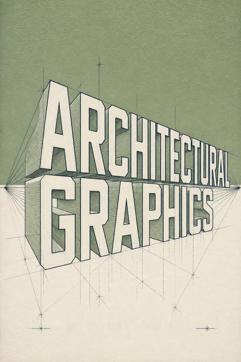


Key Takeaways
Treat drawing as spatial reasoning, not merely a polished way to present.
Drawing trains perception. Ching presents architectural drawing as more than a technique for making images. Moving a pencil across paper links eye, hand, and judgment: the drafter must assess direction, distance, proportion, and spatial relationships while making each mark. Digital tools change the means of production, but not the need to understand what a drawing communicates. The book therefore begins with tools and line-making, then moves through projection systems, rendering, presentation, and freehand work.
Practice is a form of thought. Freehand drawing is especially useful for recording observations, testing design ideas, and making spatial relationships visible. Even a simple line can distinguish an edge, a surface change, or a construction guide. The goal is not simply attractive execution. It is a graphic language that lets designers describe, inspect, and communicate three-dimensional ideas on a flat surface.
What's valuable here is the refusal to separate making from thinking. A drawing externalizes a spatial judgment, making it available for correction by the drafter and interpretation by others. That is a form of reasoning, not decoration. The tactile emphasis also gives beginners a reason to practice by hand even when their eventual work is digital. Still, hand drawing is not inherently more thoughtful: a precise model can support equally rigorous inquiry. The stronger distinction is between using a tool to investigate a design and using it merely to produce an image.
Choose a projection for the question, because every view hides something.
Views shape understanding. Architectural graphics uses three principal drawing systems. Multiview drawings show separate plans, elevations, and sections. Paraline drawings show a subject in one measured pictorial view. Perspective drawings imitate the appearance of a scene from a particular observer's position. Each is a projection of three-dimensional information onto a two-dimensional picture plane, but each preserves different relationships and leaves others unclear.
Select with intent. A plan clarifies horizontal arrangement but cannot precisely show height. A section reveals vertical space and construction relationships, while an elevation describes a facade without showing its full depth. A perspective makes a space easy to imagine, but represents a particular optical viewpoint rather than an objective, measurable whole. The drawing system affects what can be evaluated, so choosing one is also choosing what evidence to foreground.
This is a useful model for any visual explanation: a representation is not a neutral window, but a tool that makes some properties easier to notice than others. The practical question is not which view is best in general, but which view exposes the uncertainty that matters now. A designer comparing room proportions needs different evidence from a client imagining a public space. The limitation is productive, provided it is acknowledged. Problems arise when a persuasive view is mistaken for a complete account.
Make plan and section cuts darker than everything seen beyond them.
Separate cut from view. A floor plan is an orthographic view of a building after a horizontal plane cuts through it and the upper portion is removed. The cut is commonly about four feet above the floor, though its position can vary. A building section makes a vertical cut to reveal interior space, levels, and construction. Both drawings become difficult to read when cut material looks identical to surfaces seen beyond the cut.
Build a graphic hierarchy. Use the heaviest lines to profile cut walls and other solid elements, lighter lines for surfaces farther from the cut, and the lightest marks for surface patterns. A dark fill of cut material is called poché. In the Vanna Venturi House plan shown in the book, a single line weight obscures the distinction between solid and void; stronger contrast makes the plan legible.
Line weight functions like visual grammar: it tells the reader which boundaries matter before any label is read. This is especially important because plans and sections flatten depth, so the drawing must supply cues that ordinary vision gets from movement and changing viewpoint. Poché is powerful partly because it makes absence visible by defining the solid around it. But maximum contrast is not always best. At large scales, a mass of black can overwhelm the spaces being described, so hierarchy must respond to scale and purpose.
Use paraline views when measured three-dimensional clarity matters most.
Keep parallel edges parallel. A paraline drawing presents a three-dimensional object or space in one view while preserving parallel lines rather than making them converge. Lines parallel to its three principal axes can be measured to a consistent scale. Other lines, called nonaxial lines, must be located by finding their endpoints from axial measurements and connecting them.
Choose the view that helps. An isometric gives equal emphasis to the three principal directions. A plan oblique keeps horizontal surfaces true in shape, making it useful for plans with circular or complex forms. An elevation oblique keeps a significant vertical face true. These views can also explain interiors: an expanded view separates parts to show assembly, a cutaway removes material, and a phantom view makes selected parts transparent.
Paraline drawing occupies a productive middle ground between measurable plans and the immediacy of perspective. It can make a construction or spatial arrangement understandable without committing to one observer's optical view. Its clarity depends on disciplined conventions, though. Parallel edges can make forms seem ambiguous, and some alignments can cause foreground and background elements to overlap confusingly. The choice between isometric and oblique is therefore not cosmetic: it determines which faces stay truthful and which are compressed for the sake of explanation.
Build perspective around a believable viewer, not an ever-wider view.
Fix the observer first. Linear perspective projects a scene from a station point, representing one eye, through a picture plane. Parallel lines perpendicular or oblique to that plane appear to converge, and distant objects appear smaller. The horizon line marks the observer's eye level. In one-point perspective, one horizontal direction recedes toward a central vanishing point; in two-point perspective, two horizontal directions converge separately; in three-point perspective, verticals also converge.
Control the field of view. Ching treats a 60-degree cone of vision as a useful working guide, with circles kept nearer the center to reduce distortion. Moving the observer changes the apparent depth and convergence. Moving the picture plane changes image size, not the underlying relationships. Widening the view to fit more into one image can distort forms, so a convincing perspective begins with a plausible viewing position.
Perspective is persuasive because it gives a viewer somewhere to stand. That makes it effective for communicating spatial experience, but also makes it selective: a shifted station point can change which spaces dominate and how large they appear. The cone of vision is a practical safeguard against extreme distortion, not a guarantee that an image is neutral or realistic. A useful check is to ask whether the imagined observer could actually occupy the proposed position, and whether the composition is hiding important relationships outside the frame.
Use line weight and tone to make depth legible before adding texture.
Contrast carries form. Tonal value means the relative lightness or darkness of a mark or surface. Hatching, crosshatching, scribbling, and stippling build values by changing the spacing and density of marks. These methods also create texture, so a rendering can accidentally make a surface look rough or busy when the real aim is to show light and volume. In drawings without outlines, contrasts in value must define edges and changes in plane.
Make depth readable. Heavier lines can bring nearby edges forward; lighter lines, reduced detail, and muted contrast can push distant forms back. In plans and sections, tone can distinguish cut material from space. In perspective, values can clarify foreground, middle ground, and background. Shade describes surfaces turned away from light, while a shadow is cast onto another surface. Digital ray casting quickly estimates shading, while ray tracing models additional light interactions.
The book's central rendering lesson is that visual hierarchy should precede surface embellishment. This resembles information design: if every mark competes equally, the viewer cannot tell what to inspect first. Texture is particularly risky because it adds both material character and tonal weight. A drawing of brick, foliage, or patterned flooring can become visually dense enough to bury its spatial structure. The remedy is not to avoid detail, but to assign it a job and reserve the strongest contrast for the edges and relationships the drawing must explain.
Let people and landscape explain scale without stealing the building's role.
Context makes space usable. People in architectural drawings signal scale, activity, and changes of level. Their height and proportions must fit the view, and their placement should not hide significant features. Furniture and vehicles can clarify how a space is used, while trees, paving, and other landscape elements show how a building relates to its site. A site plan can also record boundaries, terrain, paths, nearby structures, and environmental features.
Match the drawing's style. Ching cautions against inserting highly realistic people or trees into a more abstract drawing. The entourage should support the architectural subject, not compete with it. In perspective, foreground details can be sharper and more contrasted, while distant landscaping can become lighter and less distinct. Reflections also need to fit the drawing's value range rather than appear as unrelated effects.
These contextual elements act as interpretive cues. A figure beside a doorway helps a viewer judge its scale; a path or tree line can show how a building meets its surroundings. Their usefulness depends on restraint. Photorealistic figures may seem to add credibility, but a mismatch in style can make the image feel assembled rather than coherent. Context should not be treated as filler, either: when a site's topography, access, or neighboring buildings affect the proposal, leaving them out can make the design appear more self-contained than it is.
Arrange presentations like an argument, from broad context to telling detail.
Sequence the evidence. A presentation usually works from general views toward specific ones, moving from a site or area plan to floor plans, sections, elevations, paraline views, and perspectives. Related drawings should share orientation where possible, and their alignment should make relationships easy to compare. White space, grouping, titles, scales, and north arrows are not afterthoughts; they help viewers understand what belongs together and how to read the set.
Edit for clarity. Ching calls for unity without uniformity, and continuity between parts of a presentation. Each drawing should communicate accurately and serve the central design idea. Unnecessary frames, decorative effects, or crowded information can distract from that purpose. A small storyboard or mockup helps test arrangements before the final layout. Digital work still needs a test print or plot, because the screen may not show the final line weights or spacing reliably.
A presentation is a sequence of claims supported by different kinds of drawings. The site plan establishes context; plans and sections explain organization; perspectives help viewers imagine experience. This framing makes layout a reasoning task, not merely a graphic-design exercise. It also explains why visual consistency matters without requiring every drawing to look identical. One limitation is that a linear sequence can steer attention too tightly. For complex proposals, clear navigation should leave viewers able to compare related evidence rather than only follow the presenter's preferred path.
Sketch to notice structure, then diagram the idea that organizes it.
Observe before abstracting. Drawing on location encourages the drafter to notice relationships that routine looking may miss, understand how parts fit into a larger structure, and preserve a visual record of a place. Contour drawing slows attention to the boundaries of forms. Analytical drawing moves from the whole to parts, using light regulating lines to test proportions, alignments, and volume before emphasizing final edges. Negative spaces matter because their boundaries are shared with the objects around them.
Reduce to essentials. A diagram strips away detail to clarify elements and relationships, such as circulation, structure, environmental forces, or public and private zones. A parti is the primary organizing idea of a design, expressed in a concise diagram. It should guide development while remaining adaptable. Digital precision can be useful, but early diagrams should not become so finished that they prematurely close off alternatives.
This progression links observation, analysis, and invention. A sketch records what is present; an analytical drawing tests how it is organized; a diagram asks which relationships matter most to a design. The emphasis on negative space is especially useful because it prevents attention from collapsing onto objects alone. Abstraction does carry a danger: reducing a place to circulation arrows or geometric zones can erase social and sensory qualities. A strong diagram is therefore a deliberate simplification, not a claim that the omitted parts are unimportant.
Analysis
Architectural Graphics is best understood as a guide to visual judgment disguised as a drawing manual. Its tools and conventions matter because they teach the reader to decide what a drawing can responsibly claim. A plan is not a small photograph from above. It is a constructed argument about horizontal organization. A perspective is not simply a more attractive plan. It is an account of space from a chosen position. Ching's strongest recurring principle is that representation always involves selection: projection, scale, line weight, tone, context, and layout determine which relationships become legible.
That principle gives the book continuing relevance despite its grounding in manual drafting. Digital modeling makes geometry easier to manipulate and allows rapid changes of view, but it does not automatically produce an intelligible drawing. A technically accurate model can still obscure the cut in a section, overload a small-scale plan, or imply a misleading viewpoint. Software can calculate; the author remains responsible for deciding what the calculation should help a viewer see. The distinction between data and communication is central to contemporary design practice.
The book also offers a useful account of learning. Freehand sketching trains attention through deliberate looking, while diagrams turn observations into provisional ideas. These practices are not competing with digital work. They help designers formulate the questions that digital tools can test. A promising extension of Ching's approach is to treat every drawing as a hypothesis: this view should make a particular spatial relationship apparent, and the viewer's difficulty reading it is evidence about the drawing, not merely the viewer.
A caution follows from the same insight. Graphic clarity can create confidence even when a proposal is incomplete. A persuasive perspective may leave out the site conditions that complicate it; a clean diagram may compress social use into categories that are too simple. The book's standards of accuracy and clarity therefore imply an ethical obligation: make the drawing readable, but also make its scope and omissions visible. The best architectural graphic does not show everything. It shows the right things for the decision at hand, without pretending that its chosen view is the whole building.
Review Summary
Architectural Graphics by Francis D.K. Ching is highly regarded by architecture students and professionals. Readers praise its comprehensive instruction on architectural drawing techniques, considering it essential for beginners. The book's clear explanations, detailed illustrations, and hand-lettered style are appreciated. Many recommend it as required reading for architectural studies. While some find it elementary, others value it as a reference guide. A few reviewers mention using it alongside online tutorials or prefer visual learning from its illustrations.
People Also Read







Glossary
Orthographic projection
Parallel, perpendicular projectionA method of representing a three-dimensional subject by projecting points onto a picture plane with parallel lines perpendicular to that plane. Surfaces parallel to the picture plane retain their true size and shape, but depth is flattened. Architectural plans, elevations, and sections are orthographic views.
Paraline drawings
Measured single-view drawingsA family of single-view drawings that shows three-dimensional form while keeping parallel lines parallel. Measurements along the principal axes can be drawn to a consistent scale, while nonaxial lines must be located through their endpoints. Isometric, dimetric, trimetric, and oblique drawings belong to this family.
Linear perspective
Converging visual projectionA drawing system that represents a three-dimensional scene as it might appear from a specific viewing position. Sight lines radiate from a station point and meet a picture plane. Parallel lines not parallel to that plane appear to converge, while objects appear smaller as they recede.
Station point
Assumed observer positionThe fixed point in space that represents the observer's single eye in a linear perspective construction. Its position affects the apparent convergence, depth, and visible faces of the subject. Changing the station point changes the viewpoint and the resulting perspective image.
Cone of vision
Practical viewing fieldThe three-dimensional field of sight lines radiating from the station point around the central axis of vision. Ching uses a 60-degree cone as a guide for placing the principal subject matter and recommends keeping circles closer to the center to limit distortion. A wider view can exaggerate forms and depth.
Poché
Tonal emphasis of cut massA dark or contrasting tonal treatment applied to walls, columns, and other solid elements cut in a plan or section. Poché distinguishes solid matter from spatial void and helps the reader identify where the drawing's cutting plane passes through the building. Its intensity should suit the drawing's scale and surrounding values.
Atmospheric perspective
Depth through fading contrastA visual depth cue in which distant forms are represented with lighter values, softer contrast, and less distinct color or detail than nearby forms. In architectural drawings, it helps separate foreground, middle ground, and background, especially in elevations and perspectives.
Ray casting
Fast digital surface shadingA digital lighting technique that evaluates three-dimensional geometry and shades surfaces according to their orientation toward an assumed light source. It can generate illuminated views quickly and support early studies of form and shadow, but does not fully model reflected or refracted light.
Ray tracing
Simulated light pathsA digital rendering technique that follows light paths as they meet surfaces and are absorbed, reflected, or refracted. Basic approaches model direct illumination and some reflections; global illumination methods also account for light bouncing among surfaces, producing a more complete simulation at greater computational cost.
Parti
Primary design organizing ideaThe central concept or organizing idea of an architectural design, expressed in a concise diagram. A parti emphasizes the scheme's essential structure and relationships rather than its finished appearance. Ching describes a strong parti as inclusive, visually descriptive, adaptable, and able to retain its identity through design changes.
FAQ
What is "Architectural Graphics" by Francis D.K. Ching about?
- Comprehensive Guide to Graphics: "Architectural Graphics" by Francis D.K. Ching is a foundational text that introduces the tools, techniques, and conventions used to communicate architectural ideas visually.
- Focus on Drawing Systems: The book covers the three principal systems of architectural representation: multiview, paraline, and perspective drawings.
- Manual and Digital Integration: It addresses both traditional hand-drawing methods and the integration of digital tools, reflecting changes in architectural practice.
- Step-by-Step Instruction: Ching provides clear, concise, and illustrated guidance on everything from basic drafting to advanced rendering and presentation techniques.
Why should I read "Architectural Graphics" by Francis D.K. Ching?
- Essential for Students and Professionals: The book is a staple in architectural education and is widely used by students, educators, and practitioners to master graphic communication.
- Builds Fundamental Skills: It helps readers develop the ability to both create and interpret architectural drawings, a critical skill in design and construction.
- Bridges Analog and Digital: Ching’s approach bridges the gap between traditional drawing skills and modern digital workflows, making it relevant for today’s evolving industry.
- Visual Learning Emphasis: The book’s visual approach, with hundreds of diagrams and examples, makes complex concepts accessible and easy to understand.
What are the key takeaways from "Architectural Graphics" by Francis D.K. Ching?
- Drawing as Communication: Effective architectural graphics are essential for conveying design ideas clearly and convincingly.
- Mastery of Drawing Systems: Understanding multiview, paraline, and perspective drawing systems is crucial for representing three-dimensional spaces on two-dimensional surfaces.
- Importance of Line Quality and Weight: The clarity, consistency, and hierarchy of lines are fundamental to readable and informative drawings.
- Integration of Context and Detail: Good drawings not only depict buildings but also their context, scale, and intended use, enhancing the communication of design intent.
What are the main drawing systems explained in "Architectural Graphics" by Francis D.K. Ching?
- Multiview Drawings: Includes plans, sections, and elevations, using orthographic projection to represent different aspects of a building.
- Paraline Drawings: Encompasses axonometric (isometric, dimetric, trimetric) and oblique projections, providing single-view pictorial representations.
- Perspective Drawings: Uses linear perspective to create experiential, optical views that simulate how spaces appear to the eye.
- Comparative Analysis: The book explains the strengths, limitations, and appropriate uses of each system in architectural design and communication.
How does Francis D.K. Ching define and use line weights and line quality in "Architectural Graphics"?
- Line Weight Hierarchy: Ching emphasizes using varying line thicknesses to distinguish between cut elements, edges, and surface details, enhancing depth and clarity.
- Uniform Density and Clarity: Lines should be consistently dense and crisp, with careful attention to how they meet at corners and intersections.
- Purposeful Use of Dashes and Breaks: Different line types (solid, dashed, centerlines, break lines) are used to represent specific architectural elements or conditions.
- Digital Considerations: The book discusses how line weights are managed in digital drawings and the importance of test prints to ensure intended output.
What tools and materials does "Architectural Graphics" by Francis D.K. Ching recommend for architectural drawing?
- Drawing Instruments: The book covers pencils (lead holders, mechanical, wood-encased), pens (technical, fountain, gel), and digital styluses.
- Guides and Aids: Essential tools include T-squares, triangles, compasses, French curves, templates, erasers, and drafting brushes.
- Drawing Surfaces: Ching discusses tracing paper, vellum, drafting film, and illustration boards, as well as digital layers in CAD programs.
- Scales and Measurement: The use of architect’s, engineer’s, and metric scales is explained for accurate dimensioning and scaling of drawings.
How does "Architectural Graphics" by Francis D.K. Ching address digital drawing and CAD/BIM technologies?
- Digital Equivalents: The book draws parallels between traditional tools and digital commands, such as drawing lines, using templates, and managing layers.
- CAD and BIM Integration: Ching explains how digital tools have transformed architectural graphics, from 2D drafting to 3D modeling and Building Information Modeling (BIM).
- Advantages and Challenges: Digital drawing allows for easy editing, scaling, and experimentation, but requires careful management of line weights and detail for clarity.
- Output Considerations: The importance of understanding the difference between on-screen images and printed/plotter output is highlighted.
What is the role of rendering tonal values and shade/shadows in "Architectural Graphics" by Francis D.K. Ching?
- Modeling Form and Space: Tonal values (hatching, crosshatching, stippling, scribbling) are used to convey light, depth, and materiality.
- Enhancing Depth and Focus: Contrasts in value help distinguish between foreground, middleground, and background, and clarify spatial relationships.
- Shade and Shadows: The book details how to project and render shadows in multiview, paraline, and perspective drawings to articulate massing and context.
- Digital Rendering: Ching discusses digital techniques like ray casting and ray tracing for simulating lighting and shadows in 3D models.
How does "Architectural Graphics" by Francis D.K. Ching explain the process of creating floor plans, sections, and elevations?
- Floor Plans: Step-by-step guidance on laying out structural grids, walls, doors, windows, and stairs, with emphasis on line weight and poché for clarity.
- Sections: Instructions for cutting through buildings to reveal spatial and structural relationships, using line hierarchy and tonal values to distinguish cut elements.
- Elevations: Techniques for projecting building facades, showing material textures, and using line weights and atmospheric perspective to suggest depth.
- Detail and Scale: The book stresses the importance of matching the level of detail to the drawing scale and including context for comprehensive communication.
What advice does Francis D.K. Ching give on architectural presentations and graphic communication?
- Clarity and Unity: Presentations should be organized, visually balanced, and free of unnecessary distractions, with a clear central idea.
- Sequencing and Relationships: Drawings should be arranged logically (left to right, top to bottom), progressing from general context to specific details.
- Use of Graphic Symbols and Lettering: North arrows, scales, section arrows, and legible, appropriately styled text are essential for effective communication.
- Formats and Visual Sets: The book offers strategies for layout, framing, and grouping drawings to reinforce relationships and guide the viewer’s understanding.
How does "Architectural Graphics" by Francis D.K. Ching approach freehand drawing and diagramming for architects?
- Observational Drawing: Emphasizes drawing from observation to sharpen awareness, understand spatial relationships, and record visual memories.
- Analytical and Contour Drawing: Encourages both analytical (structural) and contour (surface) approaches to develop visual acuity and design thinking.
- Diagramming Concepts: Diagrams are used to abstract and clarify design ideas, relationships, and processes, supporting early-stage design exploration.
- Travel Sketching and Parti: The book highlights the value of sketching on location and using parti diagrams to capture and communicate core design concepts.
What are the best quotes from "Architectural Graphics" by Francis D.K. Ching and what do they mean?
- “Drawing is not simply a matter of technique; it is also a cognitive act that involves visual perception, judgment, and reasoning of spatial dimensions and relationships.”
- This quote underscores that drawing is as much about thinking and understanding as it is about manual skill.
- “Art does not reproduce the visible; it renders visible.” —Paul Klee (quoted in the book)
- Ching uses this to emphasize that architectural graphics reveal and clarify ideas, not just replicate appearances.
- “To unlock this power requires the ability both to execute and to read the graphic language of drawing.”
- Mastery in architecture involves both creating and interpreting drawings for effective communication.
- “Each drawing system provides a limited view of what we are designing and representing. And an appreciation for what these viewpoints reveal—and conceal—remains indispensable in the design process.”
- Recognizing the strengths and limitations of each drawing method is crucial for comprehensive design understanding.
Download PDF
Download EPUB
.epub digital book format is ideal for reading ebooks on phones, tablets, and e-readers.








