

Key Takeaways
Design for memory, then let repetition and time make a logo iconic.
Build for lasting recognition. Peters separates what a designer can influence from what cannot be guaranteed. Time, a client’s marketing budget, and the quality of its product lie largely outside the designer’s control. The design itself can be shaped through simplicity, originality, usefulness, visual appeal, color, story, and the maker’s care. A mark may be well made and still fail to become widely known if few people see it or the business behind it falters.
Make each element earn its place. Repeated exposure helps a mark become familiar: Peters compares it to a route that feels easier once it has been traveled many times. A story or distinctive visual idea can help people remember a mark sooner, but neither design nor repetition alone guarantees success. Color should support the brand’s message and stand apart from competitors. The aim is a simple, ownable design that can keep working as the brand grows.
The distinction between design quality and market success is one of the book’s most useful safeguards against magical thinking. A logo is a recognition device, not a substitute for a sound product or repeated contact with an audience. This makes the designer’s job more precise: improve what is controllable, while being candid about what is not. There is also a productive tension in the appeal to universal beauty. Shared design principles can guide judgment, but audiences differ, so reactions from clients or social media should inform decisions without becoming a vote that replaces strategic reasoning.
Generate fifty rough concepts before polishing the first promising logo.
Start with the subject matter. Peters’s process begins with a brand noun list: concrete people, places, or things that could represent the organization. For an abstract value such as trust, a designer might explore objects associated with it, such as a key or shield. The client supplies knowledge of the organization; the designer helps turn that knowledge into usable visual territory. Peters gathers input from everyone who approves the work, removes duplicates, and narrows the list to roughly 15 to 25 subjects.
Separate invention from refinement. He then sketches at least 50 rough ideas, aiming to capture concepts rather than finish drawings. From there, he develops about 15 promising options digitally and replaces weaker ones if better ideas emerge. This protects the project from mistaking a first thought for the best thought. It also gives client feedback a defined sequence, rather than inviting opinions before the strategic territory is clear.
This method treats creativity as both exploration and selection. The list constrains the search enough to make it purposeful, while a large sketch count resists early attachment to the first workable answer. That resembles divergent and convergent thinking: first widen the options, then apply criteria. The process also gives clients meaningful influence at the point where their knowledge matters most. A practical caveat is that a target such as fifty sketches measures effort, not originality; the number works best as a prompt to keep exploring, not as a guarantee that the final idea is strong.
Combine brand subjects to make familiar symbols feel ownable.
Find a visual relationship. Common symbols often feel generic on their own. Peters recommends combining approved brand nouns so the result carries more than one idea without becoming an illustration. In a pizza brand example, a flame and a slice of pizza share one compact form: the empty space shaped by the flame helps define the slice. The viewer gets a small visual discovery, while the mark remains usable at different sizes.
Search for a natural fit. Peters describes several routes: let one shape overlap another, use negative space, create repeated lines that connect the subjects, or arrange forms so the eye moves through the design. A heart and an apple, for instance, can make a familiar pairing feel less expected. The crucial test is whether the elements seem to belong together. If the combination needs too many explanatory details, it may be better as an illustration than as a logo.
The appeal of this approach is that it makes distinctiveness structural rather than decorative. Instead of adding an unusual color or flourish to a generic symbol, the designer searches for a relationship that gives the mark its own logic. That relationship can reward attention while keeping the design compact. The trade-off is legibility: a clever double meaning may not register immediately, especially in a tiny application or for an unfamiliar audience. The design should therefore survive a quick glance as well as a closer look, with the secondary interpretation adding value rather than carrying the whole message.
Test the mark in tiny, monochrome, and physical applications before approval.
Design for real use. A logo may appear as a small digital icon, on embroidered clothing, on signage, or as a mark pressed into a material. Peters tests ideas at small sizes and in black on white and white on black. If the design depends on thin lines, crowded gaps, or several delicate details, those features may collapse when reduced or reproduced. He recommends adjusting line thickness, opening negative space, or simplifying the form while protecting its central idea.
Let the client’s context set the test. For the City of Eagan, staff needed a mark that could work on both water towers and stamped concrete garbage cans. Embroidery tests helped reveal where the design stopped reading clearly. Color also has a job: it can support the story and distinguish a brand from competitors. Peters favors deliberate palette choices, but the mark should remain identifiable when color is unavailable.
These tests turn an aesthetic judgment into a practical one. A mark is not finished when it looks polished on a large screen; it is finished when its essential features survive the conditions in which people encounter it. This is closely related to designing for constraints: limits on size, material, and color expose which parts of a concept are truly necessary. The tests also prevent a common mistake, treating versatility as an afterthought. Not every brand needs every possible application, so the client’s actual uses should guide the test rather than an imagined checklist.
Treat client feedback as a problem to diagnose, not an order to obey.
Translate the request. A client may ask for a larger logo when the real issue is that the surrounding design does not feel connected to the brand. Peters advises looking for the problem beneath the proposed fix. In Eagan, the client needed lettering that could be read from the road. Rather than simply choosing another typeface, he created custom lettering aligned with the mark’s geometry. When the hill detail felt too busy and hard to reproduce, he tightened the composition and reduced the lines.
Guide the decision. Peters presents 15 marks in black and white, explains the approved subjects behind each, and asks the client to choose the strongest options rather than begin with dislikes. In group meetings, stakeholders can quietly select favorites before discussion, reducing the chance that the most senior person determines everyone’s response. The designer’s role is to explain trade-offs and lead respectfully.
The method reframes client management as collaborative diagnosis. A client’s request is valuable evidence about a need, even when the requested solution is weak. Asking what the request is trying to fix preserves the client’s expertise about their business while keeping design decisions grounded in the designer’s craft. The structured presentation also helps counter group dynamics in which status can drown out useful observations. Still, leadership is not a license to dismiss disagreement: the designer needs to show how a proposed adjustment affects legibility, meaning, or use, so that guidance remains accountable rather than merely confident.
Study forgotten local design, not only today’s popular portfolios.
Widen the reference pool. Peters searches antique stores, estate sales, and small-town museums for old badges, marks, and custom lettering. Smaller towns can hold regional designs that are less likely to appear in the same online feeds followed by contemporary designers. Location matters: products made for one region often reflect its businesses and visual character, giving the researcher a different set of examples from those found elsewhere.
Study, do not copy. Peters looks for unusual badge shapes, bold marks, and distinctive typography, including solutions created before modern logo conventions became widely established. The point is not to reproduce an old design, but to understand how it solved a visual problem and use that observation to open new possibilities. A photograph is enough to preserve a reference. The designer can sort and revisit images later rather than collect piles of objects.
This is a practical antidote to creative sameness. When designers draw references from the same highly visible platforms, fashionable solutions can circulate until they look like rules. Historical and regional research introduces alternatives and helps separate durable visual ideas from current styling. The method also invites a useful question: what problem was an old design solving with the materials and conventions available to its maker? Historical inspiration still requires judgment. Age does not prove quality, and unfamiliarity does not make an idea original. References are most useful when they sharpen observation, not when they supply a ready-made look.
Make badges and brand extensions speak the logo’s visual grammar.
Build a family, not a pile. A logo system can include marks for different settings: a symbol for small spaces, horizontal and vertical arrangements, and, when appropriate, a badge for a larger surface. Peters argues that a badge can tell a fuller story through words and images, or clarify what an organization does. To design one, organize the name, mark, tagline, and other useful details by importance, then balance the lettering, icons, and open space. A badge should suit the brand, not be added by default.
Repeat the underlying design rules. Patterns, icons, typography, illustrations, and badge shapes can borrow the mark’s line weight, curves, and spacing. Peters’s squirrel icon, for example, repeats the geometry of his company’s mark, so it still feels connected without displaying a large logo. This makes each element part of a consistent visual language.
The system-level view addresses a real communication problem: a brand should be recognizable across many moments, not only when its main logo is prominent. Reusing geometric rules can create coherence without monotonous repetition. A badge adds room for information and visual character, but its greater complexity is useful only when the context can support it. The same applies to extensions: if every pattern or illustration loudly repeats the mark, the system may feel mechanical. Strong consistency comes from shared design logic, not from stamping the same symbol onto every surface.
Evolve recognizable assets instead of erasing hard-won brand equity.
Find what still works. Brand equity is the familiarity and recognition a brand accumulates through repeated use. Starting over can discard that value, even when the existing logo has visible flaws. Peters recommends first asking what causes trouble in practice: perhaps the lettering is hard to read, gradients are difficult to reproduce, or the mark is too intricate. Then preserve the recognizable idea where possible and repair its weak points.
Refine the concept. For Urbane Coffee, the existing combination of a letter and a cup had potential, but the integrated icon impaired legibility and the type was awkward. Peters separated the symbol into an independent icon, improved its distinctiveness, and chose more coherent typography. For the Eagan Police badge, he retained the expected official form while simplifying colors and detail. The goal is improvement that still feels connected to the brand’s history.
Evolution balances two different costs: the practical burden of a poor identity and the recognition lost through abrupt change. Treating existing familiarity as an asset encourages designers to ask what people already recognize before replacing it. This is more nuanced than either preserving everything or pursuing novelty for its own sake. The harder question is how much recognition actually exists, particularly for a small organization with limited exposure. A careful redesign can preserve a useful cue even when public familiarity is slight, while a more substantial change may be justified when the current design obstructs essential use.
Use passion projects to build the portfolio and practice you want.
Make room for chosen work. Peters traces his career from a childhood fascination with drawing through agency and in-house jobs to founding Peters Design Company with his wife, Maria. He describes learning from each setting, then choosing to work independently after finding that focused time suited him. Passion projects let designers pursue the subjects and visual approaches they may not encounter in paid assignments. Peters’s Badgehunting designs began as a personal interest in vintage marks and later appeared on merchandise and helped attract client work.
Connect craft to conviction. After being shot during a robbery, Peters says he became less willing to let fear drive design decisions. He also used design to respond to events affecting Minneapolis and Ukraine, directing proceeds from one collection to community support. These examples make his case for treating creative skill as something that can serve personal commitments, not only commercial briefs.
The career story gives the book’s process a human motive: repeated practice is sustained by curiosity, chosen projects, and a sense of purpose. A self-directed project can function as both a laboratory and a public signal of the work a designer wants to be hired to do. It can also have value without generating business, especially when it serves a community or helps the maker process an experience. Peters’s account is particular to his opportunities and values, so it should not be mistaken for a universal career formula. Its transferable lesson is to create some work on purpose, rather than waiting for permission.
Analysis
The book’s central contribution is a repeatable path from brand knowledge to usable visual form. Its method does not treat inspiration as a mysterious flash: it begins with shared subject matter, expands the idea pool through sketching, and then subjects the strongest concepts to geometric, functional, and client-facing tests. That sequence is especially valuable because it gives both designer and client a language for decisions. The client contributes intimate knowledge of the organization, while the designer takes responsibility for visual translation and craft.
Its account of longevity is strongest when it resists claiming that a designer can guarantee an iconic result. A sound mark still depends on exposure, product quality, and time. This distinction makes the book more credible than a promise that a clever symbol alone creates a successful brand. It also clarifies why simplicity is not the same as plainness: an effective mark must remain reproducible while carrying enough distinctiveness or story to merit recognition.
The case studies make the method tangible, though they are selected examples of successful work rather than controlled comparisons. They show how a given process can solve varied client problems, but cannot establish that one workflow is best for every designer, budget, or organization. The book’s own insistence on adaptation points toward that limit. A 50-sketch target, extensive presentation, custom typography, and physical tests may be feasible for some commissions and out of reach for others. The enduring principle is not to copy the author’s schedule exactly. It is to protect exploration, make constraints visible, and explain design choices in terms of what the brand must communicate and where it must function.
Finally, the personal narrative matters because it links craft to sustained attention. Peters’s childhood drawing, long professional apprenticeship, business partnership, personal projects, and response to trauma depict design as both a discipline and a way to participate in community. The book is most persuasive when it joins these levels: the logo is a small visual object, but its making involves research, judgment, relationships, and responsibility.
Review Summary
Logos that Last receives mixed reviews, with an overall positive rating. Many praise it as an insightful guide for designers, offering valuable processes and case studies. Beginners find it particularly helpful. Critics argue it lacks depth and variety, focusing too much on the author's work. Some appreciate Peters' design style, while others find it repetitive. The book's organization, visual examples, and practical advice are generally well-received. However, some readers expected more in-depth analysis and a broader range of logo examples beyond the author's portfolio.
People Also Read


Glossary
Brand noun process
A subject-finding exerciseA collaborative method for identifying concrete subjects that could inform a brand mark. The designer and client collect nouns connected to the organization, translate abstract values into visual subjects where useful, remove duplicates, and narrow the list before sketching. It gives early design exploration a shared strategic basis and helps separate discussion of subject matter from later evaluation of the finished symbols.
Overlapping geometry
Combining compatible formsA technique for joining two or more brand subjects by finding compatible shapes or structural lines. The designer sketches variations of each subject, compares their geometry, and looks for places where a curve, edge, or other form can serve both ideas. The aim is a cohesive symbol in which the combined subjects feel naturally related rather than pasted together.
Shape containers
Geometric badge compartmentsShapes used within a badge to organize and hold typography, symbols, or other information. The designer first arranges the content by importance and visual size, then develops containers that make the elements feel balanced and connected. Peters favors exploring forms that relate to the geometry of the brand mark, rather than automatically placing all text around a circle.
Brand equity
Accumulated brand recognitionThe familiarity and recognition a brand gains through repeated exposure to its identity. Peters uses the term to explain why replacing a logo outright can sacrifice something valuable, even when the current design has weaknesses. An evolution can retain recognizable visual cues while improving legibility, reproduction, simplicity, or suitability for the brand’s current needs.
Badgehunting
Searching for vintage designPeters’s term for seeking out old badges, logos, typography, and related visual design, particularly in antique stores, estate sales, and small-town museums. The practice supplies references outside contemporary online design feeds. Its purpose is study and inspiration rather than copying: the designer examines how past work handles shape, lettering, and storytelling, then applies those observations to new work.
Visual rhythm
Repeated forms create coherenceA way to connect parts of a mark through repeated lines, spacing, or related shapes. In Peters’s examples, repetition can bridge two subjects, guide attention, and give a design visual energy. The technique must remain restrained: extra lines should be removed when they add complexity without strengthening the concept or its readability.
FAQ
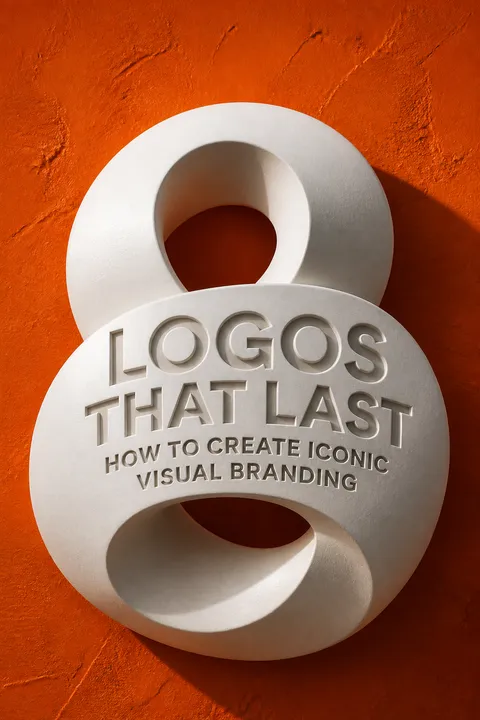
1. What’s "Logos that Last: How to Create Iconic Visual Branding" by Allan Peters about?
- Comprehensive Guide to Logo Design: The book is a practical and inspirational guide to creating logos and brand identity systems that stand the test of time.
- Author’s Proven Process: Allan Peters shares his personal, step-by-step process for designing iconic logos, developed over 20 years of experience with major brands and his own agency.
- Real-World Case Studies: The book includes detailed case studies and examples from Peters Design Company, illustrating how the process works in real client projects.
- Focus on Longevity: It emphasizes creating logos that are not trend-driven but are simple, unique, memorable, and functional for decades.
- Personal Stories and Philosophy: Peters weaves in his own journey, passion for design, and philosophy on creativity, making the book both instructional and motivational.
2. Why should I read "Logos that Last" by Allan Peters?
- Learn a Proven Method: You’ll gain access to a tested, repeatable process for designing logos that have lasting impact and value.
- Avoid Common Pitfalls: The book helps you understand what makes logos fail or become outdated, so you can avoid these mistakes in your own work.
- Inspiration and Motivation: Peters’ personal stories and passion for design will inspire you to pursue excellence and creativity in your own projects.
- Practical Tools and Tips: The book is filled with actionable advice, from sketching techniques to client presentations and revision strategies.
- Suitable for All Levels: Whether you’re a beginner or an experienced designer, the book offers insights that can elevate your craft.
3. What are the key takeaways from "Logos that Last" by Allan Peters?
- The 10 Pillars of Lasting Logos: Peters identifies seven elements you can control (passion, beauty, originality, functionality, color, memorability, simplicity) and three you can’t (time, marketing budget, product quality).
- The Brand Noun Process: Defining the right subject matter through a collaborative client exercise is crucial for strategic and meaningful logo design.
- Emphasis on Sketching and Exploration: Quantity of ideas in the sketch phase leads to higher quality and more original solutions.
- Integration and Brand Systems: A strong logo is just the start; integrating its geometry and style into patterns, icons, badges, and typography creates a cohesive brand identity.
- Client Collaboration and Selling: Educating and guiding clients through the process is essential for successful outcomes and strong, lasting marks.
4. What is Allan Peters’ unique logo design process in "Logos that Last"?
- Brand Noun Process: Start by generating a list of nouns that represent the brand’s core values and story, involving the client in this strategic step.
- Fifty Sketches Rule: Create at least 50 rough sketches, focusing on idea generation and combining brand nouns in unique ways.
- Combining Techniques: Use methods like overlapping geometry, negative space, visual rhythm, unexpected twists, and visual flow to create original marks.
- Vectorizing and Gridding: Refine the best sketches in Adobe Illustrator, applying geometric rules and testing for simplicity and functionality.
- Client Presentation and Revisions: Present 15 black-and-white options, guide the client to select top choices, and embrace revisions as opportunities to strengthen the design.
5. What are the "10 Pillars of a Long-Lasting Logo" according to "Logos that Last"?
- Three Uncontrollable Pillars: Time (how long the logo is in use), marketing budget (how often it’s seen), and product quality (the brand’s reputation) are outside the designer’s control.
- Seven Controllable Pillars: Personal passion, universal beauty, originality, functionality, color palette, memorability (story), and simplicity are within the designer’s influence.
- Each Pillar Explained: The book dedicates sections to each pillar, explaining how to achieve them and why they matter for logo longevity.
- Strategic Application: Peters shows how to address each pillar in your process, from initial sketches to final presentations.
- Real-World Examples: Case studies and illustrations demonstrate how these pillars are applied in successful logos.
6. How does the "Brand Noun Process" work in Allan Peters’ method?
- Collaborative Noun List: Both designer and client create lists of nouns (person, place, or thing) that represent the brand’s essence and values.
- Narrowing Down: The lists are combined, duplicates removed, and then narrowed to about 15 key nouns that will inspire the logo sketches.
- Metaphorical Thinking: Non-noun concepts (like “trust”) are translated into visual nouns (like “shield” or “key”) to guide the design.
- Client Buy-In: Involving the client early ensures strategic alignment and reduces subjective feedback later in the process.
- Foundation for Sketching: The final noun list becomes the creative springboard for generating a wide range of logo ideas.
7. What techniques does Allan Peters recommend for creating original and memorable logos in "Logos that Last"?
- Combining Brand Nouns: Merge two or more nouns using techniques like overlapping geometry, negative space, or visual rhythm for unique marks.
- Visual Flow and Rhythm: Use linework and composition to guide the viewer’s eye and create energy within the logo.
- Unexpected Twists: Find fresh, surprising ways to combine familiar elements, making the logo more ownable and memorable.
- Simplicity with Story: Strip away unnecessary details while retaining a clear, memorable story or concept.
- Testing for Originality: Search online to ensure your design isn’t already in use, and consider trademark checks for uniqueness.
8. How does "Logos that Last" by Allan Peters address the importance of brand systems and extensions?
- Beyond the Logo: Peters emphasizes that a logo is just one part of a larger brand identity system, which should include patterns, icons, badges, and custom typography.
- Consistent Visual DNA: All brand elements should be derived from the geometry and style of the main logo, creating a cohesive and recognizable system.
- Patterns and Icons: Use elements from the logo to create patterns and icons that reinforce the brand without overusing the main mark.
- Badge Design: The book provides a unique, detailed process for designing badges as part of the brand system, including content organization and shape containers.
- Future-Proofing: A well-developed brand system ensures flexibility and consistency across all media and applications.
9. What advice does Allan Peters give for presenting and selling logo concepts to clients in "Logos that Last"?
- Educate the Client: Clearly explain your process, the rationale behind each design, and the principles of good logo design.
- Structured Presentations: Present 15 black-and-white logo options, focusing on the approved brand nouns and showing each mark in context.
- Guide the Conversation: Encourage clients to focus on what they like, not what they dislike, and use voting to ensure all voices are heard.
- Defend Your Work: Take the lead as the design expert, respectfully guiding clients away from fear-based or subjective decisions.
- Embrace Revisions: View client feedback as an opportunity to improve the work, not as a threat to your vision.
10. How does "Logos that Last" by Allan Peters approach logo evolution and redesigns?
- Respect Brand Equity: Don’t start from scratch unless necessary; evolve existing logos to retain recognition and value built over time.
- Identify Pain Points: Ask clients about functional issues with the current logo (e.g., reproduction, legibility, color problems) before redesigning.
- Simplify and Strengthen: Focus on simplifying elements, improving typography, and clarifying the concept while keeping what works.
- Case Study Examples: The book provides before-and-after examples (e.g., Heartland Technology, Urbane Coffee, Eagan Police) to illustrate effective logo evolution.
- Strategic Color Choices: Adjust color palettes to better tell the brand’s story and stand out from competitors.
11. What are some of the most insightful quotes from "Logos that Last" by Allan Peters, and what do they mean?
- “There’s no such thing as the perfect logo, but the passion involved in chasing the perfect logo is what you need to harness to make one that stands the test of time.” — Emphasizes the importance of continual improvement and passion in design.
- “You can’t polish a turd.” — Highlights the necessity of strong ideas at the sketch phase rather than over-refining weak concepts.
- “A well-designed brand should remind you of the brand mark at every touch point without needing a gigantic logo on each page.” — Advocates for subtle, integrated branding rather than over-reliance on the logo.
- “If you take the back seat, you will not end up where you want to go. Remember you are the expert, the artist, and the specialist.” — Encourages designers to confidently lead clients through the process.
- “Passion is the fuel that drives the best design work.” — Underlines the central role of personal passion in achieving excellence.
12. How does Allan Peters recommend finding inspiration and avoiding design clichés in "Logos that Last"?
- Go Beyond Online Trends: Don’t rely solely on Pinterest, Dribbble, or Behance; seek inspiration in antique stores, estate sales, and small-town museums.
- Study the Past: Analyze vintage badges, logos, and typography to discover unique solutions and lost trends from earlier eras.
- Look for Regional Diversity: Explore different locations to find a wider variety of design styles and ideas.
- Use Inspiration, Don’t Copy: Let historical designs inform your thinking, but always create original work tailored to the client’s needs.
- Build a Personal Library: Take photos of inspiring finds rather than collecting physical items, and use them as a reference for future projects.
Download PDF
Download EPUB
.epub digital book format is ideal for reading ebooks on phones, tablets, and e-readers.








