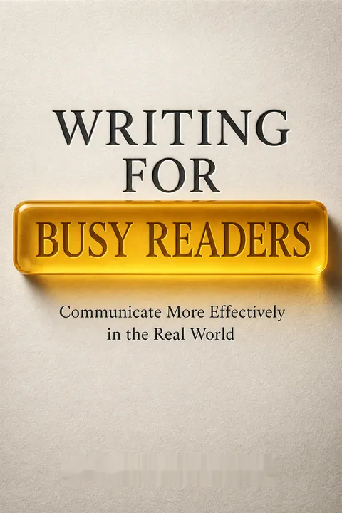


Key Takeaways
Make the reader's limited attention your design constraint
Readers make quick choices. Before acting on a message, a busy reader decides whether to open it, when to read it, how closely to pay attention, and whether to respond. These judgments happen fast, often before the reader knows the message’s full value. A subject line, sender, apparent length, or layout can determine whether the message gets a chance at all. The authors argue that writers must account for those choices instead of assuming readers will focus simply because the message matters to its sender.
Writing transfers intention. Airbnb hosts who missed an invitation to buy shares reportedly lost an opportunity worth more than $15,000, in part because the email subject line failed to signal its importance. Clear writing is not decoration. It is how an intention crosses the gap between one person’s mind and another’s.
What's striking is the shift from judging writing by what the writer meant to judging it by what a reader can actually do with it. That resembles user-centered design: a confusing door is a design failure, not proof that users should try harder. The framing is empowering because it turns communication into something testable and improvable. Still, responsibility has limits. A clearer email cannot create time, trust, or interest where none exists. The useful standard is not guaranteed compliance, but a fair chance for the intended reader to notice, understand, and choose.
Cut competing words, ideas, and requests before they bury the ask
Concision changes behavior. In one experiment, a 49-word email asking school board members to complete a survey received a 4.8% response rate, compared with 2.7% for a 127-word version. The survey itself was the same. A shorter message looked less costly to read, and made the request easier to find. In another test, a political fundraising email raised 16% more when roughly half its paragraphs were removed, despite readers judging the shorter version less coherent.
Remove more than extra words. A message can be brief yet crowded with ideas or tasks. In a climate action study, people offered fewer suggested actions took more steps than those given twenty options. Treat editing as subtraction: keep the information needed for the main goal, and move useful but secondary material to an attachment or follow-up.
The deeper point is that attention is a scarce resource distributed across a message. Each extra request competes with the others, much as adding items to a menu can make choosing harder. This makes editing a form of prioritization, not merely wordsmithing. Yet brevity is not an absolute virtue: the book’s school district example chose a warmer, longer message to rebuild parent relationships, even at the cost of fewer survey responses. The right question is not simply how short a message can be, but which goal deserves the reader’s attention now.
Choose familiar words and short sentences that survive a distracted skim
Ease helps everyone. Readability depends on familiar words, direct sentence structure, and manageable sentence length, not merely on using fewer words. A reader should be able to grasp a sentence in one pass without holding an unfinished thought in memory or backtracking to locate its meaning. The authors note that about half of American adults read at or below an eighth-grade level, and that many people read English as a second language or have dyslexia. Simpler language lowers barriers for them, and saves effort for fluent readers who are tired or distracted.
Complexity has consequences. Up to 60% of patients signing informed-consent forms may not understand the information. In a study of Facebook posts, simpler writing was associated with more likes, comments, and shares. Technical terms can be useful when readers know them, but needless complexity can make information harder to use.
Plain language is often mistaken for less serious language. In practice, clarity can signal mastery: the writer understands the idea well enough to explain it without hiding behind jargon. This also connects readability to accessibility, since a communication designed for readers with less time or literacy often works better for everyone. There is a genuine tradeoff, though. Specialized language can compress meaning among experts, and some audiences expect a formal register. The test is whether complexity adds precision for these readers, or merely makes them pay more to get the same point.
Turn a message into a map, with the crucial fact at the entrance
Readers navigate before reading. Busy people scan for landmarks, such as headings, first sentences, bullets, and visually distinct details. Put the key point where readers expect to find it, separate distinct topics, keep related details together, and order information by priority. The US Army calls one version of this approach Bottom Line Up Front, or BLUF: lead with the main point rather than making readers hunt for it.
Design can change outcomes. Researchers redesigned New York City’s court summons to put the required appearance date, time, and place near the top, with clear labels and a more legible way to identify the courthouse. Across nearly 324,000 summonses, the redesigned form reduced failure-to-appear rates by 13%. The researchers estimated this meant about 23,000 fewer arrest warrants. The information did not change. Its arrangement did.
This is information architecture applied to everyday writing. A well-designed message offers a useful overview, then lets readers choose which details need closer attention. That is especially important when people face a deadline or high stakes, because confusion can be mistaken for indifference. The summons example makes the ethical dimension vivid: poor layout can turn a missed detail into a legal consequence. A map still needs a reliable destination, however. Headings and bold labels can improve access, but they cannot compensate for inaccurate instructions or a process that is itself difficult.
Use formatting as a spotlight, not as wallpaper
Emphasis directs attention. Readers tend to interpret bold, underlined, or highlighted words as especially important. In an experiment, 65% of participants who read an unformatted passage followed a specific instruction embedded in it. When the instruction was highlighted, underlined, or bolded, 89% followed it, while spending less time on the passage. Formatting can therefore make a key detail easier to notice.
Too much emphasis blurs the signal. In another test, highlighting five sentences rather than just the important one reduced the share of participants who followed the instruction from 84% to 65%. All caps can look like anger, italics can carry different meanings, and bullets may imply that listed information matters most. Choose one clear visual cue for the main point, and use it sparingly.
Formatting works like an attention signal: once a reader learns that a visual mark means importance, the mark can guide a quick scan. But a signal loses value when everything flashes. This is a useful design principle beyond writing, from warning labels to dashboards: distinguish what matters without making the whole interface compete for notice. The complication is that readers do not share one universal visual code. A bold heading may clarify for one audience, while all caps may feel hostile to another. Writers should rely on familiar conventions or briefly explain an unusual one.
Explain why this matters to this reader, not just to you
Relevance earns attention. Readers engage more deeply with information that affects them personally. In a Rock the Vote experiment, an email asking people to volunteer was nearly four times as likely to attract sign-ups when its subject line emphasized free events, a benefit likely to matter to recipients, rather than the organization’s volunteer goal. The work was the same. The message made its value to the reader easier to see.
Identify the intended reader. A general safety warning may be easy to ignore, while a notice saying that a particular soup bought in June has been recalled tells the right people why they should pay attention. Before sending a message, ask what makes it relevant to this person, and why now. Do not manufacture a benefit or disguise the purpose: an attention-grabbing promise that misleads readers can waste their time and erode trust.
Reader-centered framing resembles a good explanation in teaching: people learn more readily when they can connect new information to a need they already recognize. It also sharpens targeting. Readers who do not need a notice can skip it, while those who do can recognize themselves immediately. The ethical boundary matters because relevance can shade into bait. The Rock the Vote example works when free events are a real benefit attached to worthwhile volunteer work. If the hook conceals a cost or misrepresents the offer, the writer may win an opening at the expense of credibility.
Remove steps between understanding a request and completing it
Make action easy. A request can be clear and valuable yet still fail if the reader must navigate too many steps. In a Washington, DC, school program, fewer than 1% of parents enrolled in text updates when they had to log into a portal. Enrollment rose to 11% when parents could reply to the invitation by text. When parents were enrolled by default and could opt out, 95% remained in the program. Students whose parents received the default enrollment also improved their grades and failed fewer courses.
Supply what action needs. Put relevant details in the message itself, offer a short list of meeting times rather than an open-ended scheduling question, and make the response options clear. A university office that included a direct calendar link secured meetings with 33% of recipients, compared with 17% using a standard request to reply with availability.
This insight connects communication to behavioral economics: small amounts of friction can determine whether an intention becomes an action. The school example also shows how defaults can scale participation, while direct links and concrete options reduce the work of deciding. But ease is not automatically ethical. Default enrollment is defensible when the service is beneficial, transparent, and simple to refuse. A streamlined path should help readers act on an informed choice, not quietly remove their opportunity to make one.
Adapt warmth and formality without letting stereotypes write your message
Tone carries social meaning. A concise message can sound efficient from one sender and abrupt from another, because readers bring expectations about status, gender, and race. The authors describe two editors who switched email signatures: clients treated the female editor’s suggestions more seriously when they appeared to come from her male colleague, while the male editor experienced more questioning when using her signature. Research also finds that people may respond less often to emails they believe came from Black senders.
Choose tone with context in mind. A short, personal opening can make a practical request feel considerate. But expectations of extra warmth can place an unfair burden on women and lower-status writers. The goal is to understand how style may be received without treating biased expectations as rules everyone must obey. Clear communication assumes good faith; deliberate obscurity can be a warning that the writer wants something hidden.
The book’s strongest complication is that communication advice operates inside unequal social systems. A universal preference for brevity may not produce universal results when readers interpret the same tone through stereotypes. Naming that gap prevents practical guidance from becoming blame directed at writers who already face extra scrutiny. At the same time, awareness is not endorsement: adapting to a biased audience can be a strategic choice, but it should not be mistaken for a fair standard. The distinction between clarity and persuasion also matters. A message can be easy to understand and still use its clarity to pressure or mislead.
Pick the channel and timing that fit the action, not your habit
A message lives in a medium. Texts arrive quickly but can disappear from attention once read. Email supports more detail and links, but overloaded inboxes make messages easy to miss. Paper mail takes longer, yet can remain visible as a reminder. In one study, postcards were nearly twice as effective as emails at increasing college students’ enrollment in California’s CalFresh food program.
Tune repetition to the reader. Reminders can prompt action, but too many may be ignored. In a study of people taking HIV medication in Kenya, weekly text reminders improved adherence for some patients, while daily reminders did not outperform receiving no reminders. Send action requests close enough to the deadline to matter, but with enough time to act. If the same audience receives repeated messages, vary or preserve their packaging according to whether each message offers new value or a familiar useful task.
Channel choice is part of message design, not a delivery detail. A reminder that stays in view can suit a multistep task, while a timely text can fit an immediate action. The CalFresh and medication examples also resist simplistic rules: paper is not always better than digital, and more reminders are not always more effective. Communication habits change as people grow accustomed to a medium. The practical implication is to observe outcomes and audience preferences, then adjust. Familiarity with a tool is not evidence that readers notice or trust it.
Analysis
Writing for Busy Readers treats practical communication as a human-factors problem. The reader has constrained time and attention, so every element of a message creates either friction or support: its length affects the perceived cost, its language affects comprehension, its design affects navigation, and its requested action affects follow-through. The book’s central move is to make the writer responsible for designing around those constraints rather than expecting readers to behave like patient, linear proofreaders.
Its strongest evidence comes from field experiments in consequential settings. Shorter school outreach generated more responses, a redesigned court summons reduced missed appearances, and simplified benefit communications increased uptake. These examples make writing feel less cosmetic than infrastructural. A confusing message can change who receives a service, misses a deadline, or participates in a civic process. Accessibility therefore becomes a practical measure of fairness, not merely a stylistic preference.
The framework also has an important limit: effective communication is not identical to ethical communication. Clear wording and frictionless action can serve a reader, but they can also make persuasion more efficient. The authors address this by emphasizing truthfulness, context, and the reader’s interests. That distinction should remain central whenever writers use defaults, personalization, urgency, or emotional appeals. Success should not be measured only by clicks or compliance. Comprehension, informed choice, and trust matter too.
A useful way to apply the book is to treat every message as a small interface. State its purpose, expose the most important information, reduce avoidable effort, and make the next step legible. Then ask whether the message helps the intended person make a good decision, not merely whether it produces the sender’s desired response. That final test preserves the book’s practical force while guarding against turning behavioral insight into manipulation. The result is writing that is not only more likely to work, but more worthy of the attention it asks people to give.
Review Summary
Writing for Busy Readers receives mixed reviews, with an average rating of 3.92 out of 5. Many readers find the book's advice on concise, effective writing helpful and immediately applicable. The book's emphasis on brevity, clear formatting, and reader-focused content is appreciated. However, some criticize it for being too basic, repetitive, or not following its own advice. Positive reviews highlight its practical tips and behavioral science backing, while negative reviews suggest the content could have been condensed into a shorter format.
People Also Read



Glossary
Bottom Line Up Front (BLUF)
Main point firstA writing approach that places the central information or requested action at the beginning of a message. The US Army uses BLUF as guidance for correspondence, so readers can quickly identify the purpose. It is especially useful when recipients may skim, but writers should account for situations where a direct opening may seem abrupt or violate audience expectations.
signposting
A preview of structureBrief introductory language that tells readers what a message contains and how its parts are organized. Signposting can help a busy reader decide where to focus, especially in a long message or one with several topics. It adds words, but may reduce the effort required to navigate the information that follows.
early quitting
Stopping before the endA reader’s decision to stop engaging with a message before reaching its end, often because it appears too long, demanding, or crowded with ideas. The reader may intend to return, but can miss a deadline or never come back. Writers can reduce this risk by making the purpose clear and removing content that does not serve it.
attention tax
Effort imposed on readersThe mental effort a message demands from its reader, particularly when it offers too many choices, requires searching for information, or makes the requested action difficult to understand. Reducing this tax can make follow-through more likely. The term highlights that communication costs readers more than the time needed to read the words.
truth test
Check for honest intentA reader-facing caution for evaluating difficult or unusually obscure communication. The authors assume effective writers want to be understood, but note that some writers may instead use complexity to conceal information. The truth test asks readers to consider whether unclear language reflects poor writing or a deliberate attempt to hide something important.
FAQ
What's "Writing for Busy Readers" about?
- Purpose of the book: "Writing for Busy Readers" by Todd Rogers is designed to help individuals communicate more effectively through writing, especially in a world where readers are often overwhelmed with information.
- Focus on busy readers: The book emphasizes understanding the mindset of busy readers and provides strategies to ensure that written communication is clear, concise, and engaging.
- Research-based insights: It draws on a vast body of research and the authors' professional experiences to offer proven techniques for effective communication.
- Practical application: The book is structured to provide actionable advice that can be applied to various forms of writing, from emails to reports.
Why should I read "Writing for Busy Readers"?
- Improve communication skills: The book offers valuable insights into making your writing more effective, which can enhance personal and professional interactions.
- Time-saving techniques: By learning to write concisely and clearly, you can save time for both yourself and your readers, leading to more efficient communication.
- Research-backed strategies: The advice is grounded in scientific research, ensuring that the techniques are reliable and effective.
- Universal applicability: Whether you're writing emails, reports, or social media posts, the principles in the book can be applied to improve all forms of written communication.
What are the key takeaways of "Writing for Busy Readers"?
- Less is more: Conciseness is crucial; using fewer words and ideas makes your writing more engaging and easier to understand.
- Make reading easy: Use short, common words and straightforward sentences to enhance readability.
- Design for navigation: Structure your writing to help readers quickly find and understand key information.
- Emphasize relevance: Clearly communicate why the reader should care about your message to increase engagement.
How does "Writing for Busy Readers" suggest making writing more concise?
- Omit needless words: Replace long phrases with shorter alternatives without losing meaning.
- Limit ideas: Focus on the most important points and avoid overloading the reader with information.
- Reduce requests: Make fewer demands on the reader to increase the likelihood of a response.
- Edit ruthlessly: Continuously revise your writing to ensure every word serves a purpose.
What are the six principles of effective writing according to "Writing for Busy Readers"?
- Less is More: Use fewer words, ideas, and requests.
- Make Reading Easy: Employ short, common words and straightforward sentences.
- Design for Easy Navigation: Make key information visible and organize content logically.
- Use Enough Formatting but No More: Highlight important ideas without overusing formatting.
- Tell Readers Why They Should Care: Emphasize the relevance of your message to the reader.
- Make Responding Easy: Simplify the steps required for the reader to take action.
How does "Writing for Busy Readers" address the use of formatting?
- Purpose of formatting: Formatting like bolding, underlining, and highlighting can draw attention to important information.
- Match expectations: Use formatting in ways that align with readers' expectations to avoid confusion.
- Limit use: Overusing formatting can dilute its effectiveness and distract from the main message.
- Strategic application: Apply formatting judiciously to emphasize key points without overwhelming the reader.
What does "Writing for Busy Readers" say about understanding your reader's perspective?
- Reader's mindset: Recognize that readers are often busy and have limited time and attention.
- Engagement process: Understand the four-stage process readers go through: deciding whether, when, and how to engage, and whether to respond.
- Personal relevance: Emphasize why the message is important to the reader to increase engagement.
- Tailored communication: Consider the reader's needs and preferences to make your writing more effective.
How does "Writing for Busy Readers" suggest using visuals in writing?
- Enhance understanding: Visuals can convey complex information more clearly and quickly than text alone.
- Use sparingly: Only include visuals when they add value and do not distract from the main message.
- Types of visuals: Consider using tables, graphs, and infographics to simplify and clarify information.
- Complement text: Ensure that visuals support and enhance the written content rather than replace it.
What are some of the best quotes from "Writing for Busy Readers" and what do they mean?
- "Less is more": This quote encapsulates the principle that concise writing is more effective and engaging for busy readers.
- "Make reading easy": Emphasizes the importance of using simple language and clear structure to enhance readability.
- "Design for easy navigation": Highlights the need to organize content in a way that helps readers quickly find key information.
- "Tell readers why they should care": Stresses the importance of making the relevance of your message clear to the reader.
How does "Writing for Busy Readers" address the challenges of writing for diverse audiences?
- Understand your audience: Recognize the varied needs and preferences of different readers to tailor your writing accordingly.
- Use inclusive language: Avoid jargon and technical terms that may not be understood by all readers.
- Balance detail and clarity: Provide enough information to be informative without overwhelming the reader.
- Consider multiple perspectives: Be mindful of cultural and contextual differences that may affect how your message is received.
How does "Writing for Busy Readers" suggest handling multiple pieces of information in a message?
- Prioritize information: Determine which pieces of information are most important and focus on those.
- Use signposting: Clearly indicate the structure of your message to help readers navigate multiple points.
- Separate or bundle: Decide whether to include all information in one message or send multiple messages based on the context and reader preferences.
- Preview content: Provide an overview of what the message will cover to set reader expectations.
What does "Writing for Busy Readers" say about the timing and medium of communication?
- Consider reader habits: Send messages when readers are most likely to have time and motivation to engage.
- Action-oriented timing: Align the timing of messages with when the action needs to be taken.
- Choose the right medium: Match the communication method to the message's purpose and the reader's preferences.
- Adapt to changes: Be aware of evolving norms and preferences in communication methods to maintain effectiveness.
Download PDF
Download EPUB
.epub digital book format is ideal for reading ebooks on phones, tablets, and e-readers.








